Как заставить эти панели отображаться в формате прокручиваемой таблицы?
Итак, я пытаюсь воспроизвести этот стиль:
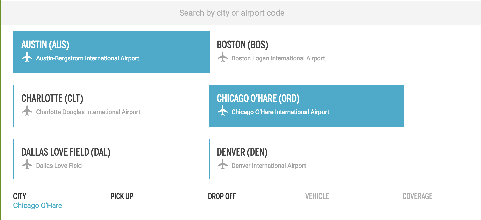
Такая таблица выше загружается динамически через Redux:
class LocationList extends React.Component {
  componentDidMount() {
    this.props.fetchLocations();
  }

  renderLocation() {
    return this.props.locations.map(location => {
      return (
        <div className = "" key = {location.id}>
          <div className = "location">
            <h1>
              {location.name}
              {location.airport_code}
            </h1>
            <div className = "location-secondary-info">
              <span>
                <MaterialIcon icon = "airplanemode_active" />
                {location.description}
              </span>
            </div>
          </div>
        </div>
      );
    });
  }

  render() {
    return <div className = "locations-container">{this.renderLocation()}</div>;
  }
}
Однако у меня возникли проблемы с правильным стилем. Итак, то, что вы видите выше, можно прокручивать вертикально.
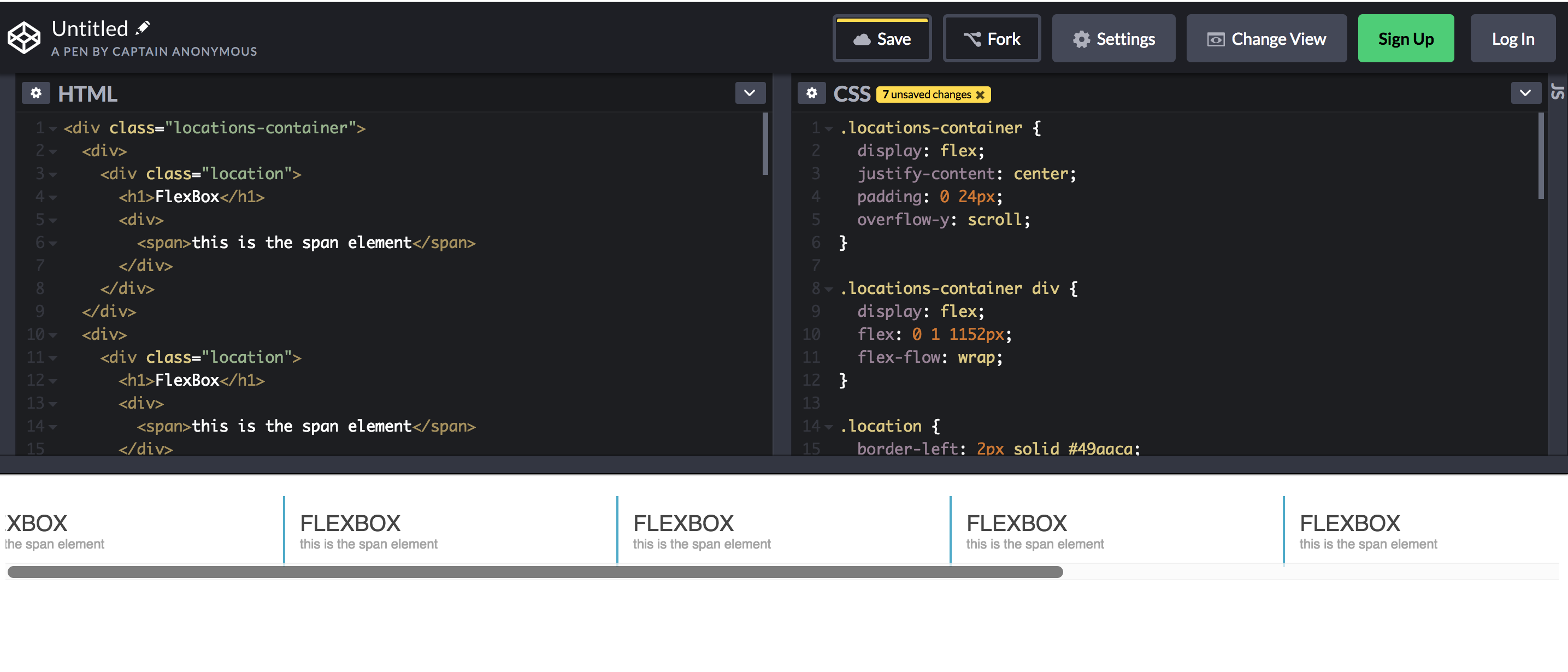
У меня возникли проблемы с тем, чтобы сделать это прямо в моем JSX, поэтому я решил использовать Codepen.io.
Кажется, я не могу получить этот формат таблицы, поэтому вместо этого он просто прокручивается по горизонтали, как одна большая строка.
.locations-container {
  display: flex;
  justify-content: center;
  padding: 0 24px;
  overflow-y: scroll;
}

.locations-container div {
  display: flex;
  flex: 0 1 1152px;
  flex-flow: wrap;
}

.location {
  border-left: 2px solid #49aaca;
  padding: 14px;
  margin: 12px 0;
  flex: 1 1;
  min-width: 275px;
  max-width: 355px;
}

.location h1 {
  padding: 0;
  margin: 0;
  font-family: sans-serif;
  font-weight: 500;
  font-size: 20px;
  color: #454545;
  text-transform: uppercase;
}

.location span {
  font-family: "Roboto", sans-serif;
  font-size: 12px;
  color: #a3a3a3;
}

.location:hover {
  background-color: #49aaca;
}

.location:hover h1 {
  color: #fff;
}

.location:hover span {
  color: #fff;
}
<div class = "locations-container">
<div>
<div class = "location">
<h1>FlexBox</h1>
<div>
<span>this is the span element</span>
</div>
</div>
</div>
<div>
<div class = "location">
<h1>FlexBox</h1>
<div>
<span>this is the span element</span>
</div>
</div>
</div>
<div>
<div class = "location">
<h1>FlexBox</h1>
<div>
<span>this is the span element</span>
</div>
</div>
</div>
<div>
<div class = "location">
<h1>FlexBox</h1>
<div>
<span>this is the span element</span>
</div>
</div>
</div>
<div>
<div class = "location">
<h1>FlexBox</h1>
<div>
<span>this is the span element</span>
</div>
</div>
</div>
<div>
<div class = "location">
<h1>FlexBox</h1>
<div>
<span>this is the span element</span>
</div>
</div>
</div>
<div>
<div class = "location">
<h1>FlexBox</h1>
<div>
<span>this is the span element</span>
</div>
</div>
</div>
<div>
<div class = "location">
<h1>FlexBox</h1>
<div>
<span>this is the span element</span>
</div>
</div>
</div>
<div>
<div class = "location">
<h1>FlexBox</h1>
<div>
<span>this is the span element</span>
</div>
</div>
</div>
</div>Поэтому я воспроизвел его на чистом HTML и CSS. Очевидно, я недостаточно знаю Flex, чтобы понять этот последний элемент дизайна.


![Безумие обратных вызовов в javascript [JS]](https://i.imgur.com/WsjO6zJb.png)


Ответы 1
Вам нужно объявить flex-wrap: wrap на контейнере (.locations-container). Потому что оно переопределяет значение по умолчанию, которое равно nowrap. Если вы установили overflow-y: scroll, вам нужно определить высоту. Пример: height:200px;
Кроме того, чтобы исправить только 3 элемента, которые вы можете заменить flex: 1 0 1152px;, я не уверен, почему вы используете 1152px, но % должен быть предпочтительнее: flex: 1 0 30%;
С flex-grow: 1, определенным в сокращении flex, нет необходимости, чтобы flex-basis составляло 33%, что на самом деле привело бы к меньшему количеству элементов в строке из-за полей и отступов.
Поскольку flex-grow будет занимать свободное место в строке, flex-basis должен быть достаточно большим, чтобы обеспечить перенос. В этом случае с flex-basis: 30% есть много места для полей, но никогда не хватает места для ненужного элемента. Обратите внимание, что, поскольку у вас есть min-width, это не будет 3 элемента в строке, если ему не хватает места.
Вы можете использовать media query для ответа на вопрос. Что в примере я использую width:952px;
.locations-container {
  display: flex;
  /*justify-content: center;
  padding: 0 24px;*/
  overflow-y: scroll; /*if you set overflow-y: scroll, you need to define the height.example:*/
  height:200px;
  width: 952px; /*demo purpose since you had min-width*/
  flex-wrap: wrap; /*flex-wrap: wrap on the container. Is necessary, because it overrides the default value, which is nowrap*/
}

@media (min-width: 952px){
  .locations-container{
    width: 100%;
  }
}

.locations-container div {
  display: flex;
  /*flex: 1 0 1152px;*//*I'm not sure why you use 1152px, but % should be preferable*/
  flex: 1 0 30%;
  /*flex-flow: wrap;*//*doesn't seem to do anything*/
}

.location {
  border-left: 2px solid #49aaca;
  padding: 14px;
  margin: 12px 0;
  flex: 1 1;
  min-width: 275px;
  max-width: 355px;
}

.location h1 {
  padding: 0;
  margin: 0;
  font-family: sans-serif;
  font-weight: 500;
  font-size: 20px;
  color: #454545;
  text-transform: uppercase;
}

.location span {
  font-family: "Roboto", sans-serif;
  font-size: 12px;
  color: #a3a3a3;
}

.location:hover {
  background-color: #49aaca;
}

.location:hover h1 {
  color: #fff;
}

.location:hover span {
  color: #fff;
}
<div class = "locations-container">
<div>
<div class = "location">
<h1>FlexBox</h1>
<div>
<span>this is the span element</span>
</div>
</div>
</div>
<div>
<div class = "location">
<h1>FlexBox</h1>
<div>
<span>this is the span element</span>
</div>
</div>
</div>
<div>
<div class = "location">
<h1>FlexBox</h1>
<div>
<span>this is the span element</span>
</div>
</div>
</div>
<div>
<div class = "location">
<h1>FlexBox</h1>
<div>
<span>this is the span element</span>
</div>
</div>
</div>
<div>
<div class = "location">
<h1>FlexBox</h1>
<div>
<span>this is the span element</span>
</div>
</div>
</div>
<div>
<div class = "location">
<h1>FlexBox</h1>
<div>
<span>this is the span element</span>
</div>
</div>
</div>
<div>
<div class = "location">
<h1>FlexBox</h1>
<div>
<span>this is the span element</span>
</div>
</div>
</div>
<div>
<div class = "location">
<h1>FlexBox</h1>
<div>
<span>this is the span element</span>
</div>
</div>
</div>
<div>
<div class = "location">
<h1>FlexBox</h1>
<div>
<span>this is the span element</span>
</div>
</div>
</div>
</div>
Я хотел бы исправить это до 3 пунктов.