Хлебные крошки, которые сжимаются, чтобы скрыть содержимое
Я надеюсь выполнить кое-какие сокращения хлебных крошек (надеюсь, без js... но я могу согласиться на vanilla js)
У меня есть неизвестное количество элементов, которые должны идти в виде хлебных крошек (не для навигации)
где активный элемент всегда доступен для чтения, и если элементов достаточно мало, все они доступны для чтения (т.е. неактивные вкладки масштабируют свою ширину, чтобы соответствовать доступной ширине, оставленной после того, как активный элемент полностью виден). Я следовал руководству и получил его довольно близко (но я не могу понять, как это масштабировать)
/* BREADCRUMBS.CSS */
ul.breadcrumb {
  list-style: none;
  width: 460px;
  height: 40px;
  border-radius: 2px;
  border: solid 1px #d2d2d2;
}

ul.breadcrumb li {
  float: left;
  border-top: 1px solid #d2d2d2;
  border-bottom: 1px solid #d2d2d2;
  font: 14px Roboto, "Helvetica Neue", sans-serif;
}
ul.breadcrumb li:first-of-type {
  border-left: 1px solid #d2d2d2;
}

ul.breadcrumb li span.inner {
  overflow: hidden;
  direction: rtl;
  white-space: nowrap;
  /* keeps everything on one line */
  width: 100%;
}

ul.breadcrumb li {
  color: #4a4a4a;
  font-weight: bold;
  text-decoration: none;
  padding: 10px 0 10px 40px;
  background: #F5F5F5;
  position: relative;
  display: block;
  min-width: 10px;
  float: left;
  padding-right: 1em;
}

ul.breadcrumb li.active {
  color: #396d9a;
  background: white;
  min-width: 150px;
}

ul.breadcrumb li::before {
  content: " ";
  display: block;
  width: 0;
  height: 0;
  border-top: 22px solid transparent;
  border-bottom: 21px solid transparent;
  border-left: 12px solid #d2d2d2;
  position: absolute;
  top: 50%;
  margin-top: -22px;
  margin-left: 1px;
  left: 100%;
  z-index: 1;
}

ul.breadcrumb li::after {
  content: " ";
  display: block;
  width: 0;
  height: 0;
  border-top: 22px solid transparent;
  /* Go big on the size, and let overflow hide */
  border-bottom: 21px solid transparent;
  border-left: 12px solid #F5F5F5;
  position: absolute;
  top: 50%;
  margin-top: -22px;
  left: 100%;
  z-index: 2;
}

ul.breadcrumb li.active::after {
  border-left: 12px solid white;
}

ul.breadcrumb li:last-child {
  border-right: 1px solid #d2d2d2;
  padding-right: 1em;
}
ul.breadcrumb li:last-child::before {
  display: none;
  border: none;
}
ul.breadcrumb li:last-child::after {
  display: none;
  border: none;
}
<!-- breadcrumbs.html !-->
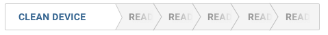
Example 1. Works fine with a couple of items
<ul class = "breadcrumb ng-star-inserted">
<li class = "active ng-star-inserted"><span class = "inner">CLEAN DEVICE</span></li>
<li class = "pending ng-star-inserted"><span class = "inner">Reading</span></li>
<li class = "pending ng-star-inserted"><span class = "inner">Reading</span></li>
</ul>
<hr/>
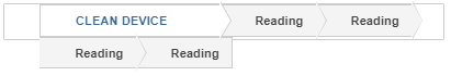
How Do i make inactive items shrink (and hide text as needed) so they all fit on the same row? while keeping the active tabs text visible
<ul class = "breadcrumb ng-star-inserted">
<li class = "active ng-star-inserted"><span class = "inner">CLEAN DEVICE</span></li>
<li class = "pending ng-star-inserted"><span class = "inner">Reading</span></li>
<li class = "pending ng-star-inserted"><span class = "inner">Reading</span></li>
<li class = "pending ng-star-inserted"><span class = "inner">Reading</span></li>
<li class = "pending ng-star-inserted"><span class = "inner">Reading</span></li>
</ul>(Кроме того, я не женат ни на одной из представленных здесь концепций (т.е. если это проще с элементами, отличными от ul)) ... в основном я просто ужасен в css :(


Ответы 2
Вы можете попробовать флексбокс для этого:
добавить
display: flexкul(при желании переопределить его отступ по умолчанию),добавьте
flex: 0 0 autoк первому и последнемуli(это сокращение, которое говорит, что гибкий элемент не должен увеличиваться или уменьшаться, а должен принимать только ширину авто),и, при желании, удалите
min-widthиз первогоli.
См. демо ниже:
/* BREADCRUMBS.CSS */
ul.breadcrumb {
  list-style: none;
  width: 460px;
  height: 40px;
  border-radius: 2px;
  border: solid 1px #d2d2d2;
  display: flex; /* added */
  padding: 0; /* added */
}

ul.breadcrumb li {
  float: left;
  border-top: 1px solid #d2d2d2;
  border-bottom: 1px solid #d2d2d2;
  font: 14px Roboto, "Helvetica Neue", sans-serif;
}
ul.breadcrumb li:first-of-type {
  border-left: 1px solid #d2d2d2;
}

ul.breadcrumb li span.inner {
  overflow: hidden;
  direction: rtl;
  white-space: nowrap;
  /* keeps everything on one line */
  width: 100%;
}

ul.breadcrumb li {
  color: #4a4a4a;
  font-weight: bold;
  text-decoration: none;
  padding: 10px 0 10px 40px;
  background: #F5F5F5;
  position: relative;
  display: block;
  min-width: 10px;
  float: left;
  padding-right: 1em;
}

ul.breadcrumb li.active {
  color: #396d9a;
  background: white;
  /*min-width: 150px;*/
  flex: 0 0 auto; /* added */
}

ul.breadcrumb li::before {
  content: " ";
  display: block;
  width: 0;
  height: 0;
  border-top: 22px solid transparent;
  border-bottom: 21px solid transparent;
  border-left: 12px solid #d2d2d2;
  position: absolute;
  top: 50%;
  margin-top: -22px;
  margin-left: 1px;
  left: 100%;
  z-index: 1;
}

ul.breadcrumb li::after {
  content: " ";
  display: block;
  width: 0;
  height: 0;
  border-top: 22px solid transparent;
  /* Go big on the size, and let overflow hide */
  border-bottom: 21px solid transparent;
  border-left: 12px solid #F5F5F5;
  position: absolute;
  top: 50%;
  margin-top: -22px;
  left: 100%;
  z-index: 2;
}

ul.breadcrumb li.active::after {
  border-left: 12px solid white;
}

ul.breadcrumb li:last-child {
  border-right: 1px solid #d2d2d2;
  padding-right: 1em;
  flex: 0 0 auto; /* added */
}
ul.breadcrumb li:last-child::before {
  display: none;
  border: none;
}
ul.breadcrumb li:last-child::after {
  display: none;
  border: none;
}
<!-- breadcrumbs.html !-->
Example 1. Works fine with a couple of items
<ul class = "breadcrumb ng-star-inserted">
<li class = "active ng-star-inserted"><span class = "inner">CLEAN DEVICE</span></li>
<li class = "pending ng-star-inserted"><span class = "inner">Reading</span></li>
<li class = "pending ng-star-inserted"><span class = "inner">Reading</span></li>
</ul>
<hr/>
How Do i make inactive items shrink (and hide text as needed) so they all fit on the same row? while keeping the active tabs text visible
<ul class = "breadcrumb ng-star-inserted">
<li class = "active ng-star-inserted"><span class = "inner">CLEAN DEVICE</span></li>
<li class = "pending ng-star-inserted"><span class = "inner">Reading</span></li>
<li class = "pending ng-star-inserted"><span class = "inner">Reading</span></li>
<li class = "pending ng-star-inserted"><span class = "inner">Reading</span></li>
<li class = "pending ng-star-inserted"><span class = "inner">Reading</span></li>
</ul>Одним из подходов может быть использование flex-box для достижения адаптивного размера элементов хлебной крошки по мере необходимости.
Кроме того, для достижения эффекта затухания вы можете ввести псевдоэлемент, который имеет linear-gradient затухание от прозрачного до серого цвета фона во внутреннем диапазоне для pending элементов списка.
Приведенные ниже настройки CSS должны достичь того, что вам нужно:
/* Use flex box to auto size width of breadcrumb elements */
ul.breadcrumb {
  display:flex;
  flex-direction:row;
}

/* Update styling of inner span to position with absolute so
that left and right extents can be set */
ul.breadcrumb li.pending span.inner {
  position:absolute;
  width:unset;
  left:1.5rem;
  right:0;
  direction:ltr;
}

/* Create pseudo element on inner span which overlays graidient
to achieve fade-out effect */
ul.breadcrumb li.pending span::after {
  content: '';
    display: block;
    position: absolute;
    right: 0;
    top: 0;
    height: 100%;
    width: 100%;
    background: linear-gradient(90deg, transparent,#F5F5F5);
}

/* BREADCRUMBS.CSS */
ul.breadcrumb {
  list-style: none;
  width: 460px;
  height: 40px;
  border-radius: 2px;
  border: solid 1px #d2d2d2;
}

ul.breadcrumb li {
  float: left;
  border-top: 1px solid #d2d2d2;
  border-bottom: 1px solid #d2d2d2;
  font: 14px Roboto, "Helvetica Neue", sans-serif;
}
ul.breadcrumb li:first-of-type {
  border-left: 1px solid #d2d2d2;
}

ul.breadcrumb li span.inner {
  overflow: hidden;
  direction: rtl;
  white-space: nowrap;
  /* keeps everything on one line */
  width: 100%;
}

ul.breadcrumb li {
  color: #4a4a4a;
  font-weight: bold;
  text-decoration: none;
  padding: 10px 0 10px 40px;
  background: #F5F5F5;
  position: relative;
  display: block;
  min-width: 10px;
  float: left;
  padding-right: 1em;
}

ul.breadcrumb li.active {
  color: #396d9a;
  background: white;
  min-width: 150px;
}

ul.breadcrumb li::before {
  content: " ";
  display: block;
  width: 0;
  height: 0;
  border-top: 22px solid transparent;
  border-bottom: 21px solid transparent;
  border-left: 12px solid #d2d2d2;
  position: absolute;
  top: 50%;
  margin-top: -22px;
  margin-left: 1px;
  left: 100%;
  z-index: 1;
}

ul.breadcrumb li::after {
  content: " ";
  display: block;
  width: 0;
  height: 0;
  border-top: 22px solid transparent;
  /* Go big on the size, and let overflow hide */
  border-bottom: 21px solid transparent;
  border-left: 12px solid #F5F5F5;
  position: absolute;
  top: 50%;
  margin-top: -22px;
  left: 100%;
  z-index: 2;
}


ul.breadcrumb li.active::after {
  border-left: 12px solid white;
}

ul.breadcrumb li:last-child {
  border-right: 1px solid #d2d2d2;
  padding-right: 1em;
}
ul.breadcrumb li:last-child::before {
  display: none;
  border: none;
}
ul.breadcrumb li:last-child::after {
  display: none;
  border: none;
}
<!-- breadcrumbs.html !-->
Example 1. Works fine with a couple of items
<ul class = "breadcrumb ng-star-inserted">
<li class = "active ng-star-inserted"><span class = "inner">CLEAN DEVICE</span></li>
<li class = "pending ng-star-inserted"><span class = "inner">Reading</span></li>
<li class = "pending ng-star-inserted"><span class = "inner">Reading</span></li>
</ul>
<hr/>
How Do i make inactive items shrink (and hide text as needed) so they all fit on the same row? while keeping the active tabs text visible
<ul class = "breadcrumb ng-star-inserted">
<li class = "active ng-star-inserted"><span class = "inner">CLEAN DEVICE</span></li>
<li class = "pending ng-star-inserted"><span class = "inner">Reading</span></li>
<li class = "pending ng-star-inserted"><span class = "inner">Reading</span></li>
<li class = "pending ng-star-inserted"><span class = "inner">Reading</span></li>
<li class = "pending ng-star-inserted"><span class = "inner">Reading</span></li>
</ul>@JoranBeasley привет, пожалуйста - рад, что смог помочь :)
огромное спасибо и за это :) лол, как будто ты читаешь мои мысли :)