Настройте панель NavigationView, чтобы включить изображение UWP
Я пытаюсь настроить NavigationView на UWP C# XAML, чтобы иметь статическое изображение приложения в верхней части левой панели, которое не перенаправляет на страницу, а просто значок приложения.
Официальный документация упоминает только отображение заголовка приложения с использованием опции Canvas.Index 0/1 и настройку фона.
<NavigationView OpenPaneLength = "200"
                x:Name = "navigationView"
                SelectedItem = "{x:Bind ViewModel.Selected, Mode=OneWay}"
                Header = "{x:Bind ViewModel.Selected.Content, Mode=OneWay}"
                IsSettingsVisible = "True"
                IsPaneToggleButtonVisible = "True"
                Background = "{ThemeResource SystemControlBackgroundAltHighBrush}">
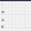
Я хотел бы настроить его так, чтобы вверху было изображение размером не менее 100x100 пикселей.
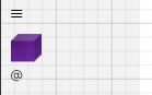
Что я пробовал? : Я попробовал приведенный ниже код, но изображение занимает только пространство значков слева.
<NavigationViewItem>
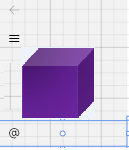
<Image Source = "/Assets/Cubes/purple.png"
HorizontalAlignment = "Center"></Image>
</NavigationViewItem>
<NavigationViewItem>
    <Image Source = "/Assets/Cubes/purple.png"
           HorizontalAlignment = "Center" MinHeight = "100" MinWidth = "100"></Image>
</NavigationViewItem>
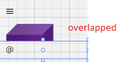
<NavigationViewItem Height = "100">
    <Image Source = "/Assets/Cubes/purple.png"
           HorizontalAlignment = "Center" MinHeight = "100" MinWidth = "100"></Image>
</NavigationViewItem>
Ожидал
Можно ли добиться этого с помощью NavigationView или мне нужно использовать другие элементы пользовательского интерфейса, такие как SplitView или MasterDetailView?


Ответы 1
Проблема связана с тем, что для высоты корневой панели элемента управления NavigationViewItem установлено фиксированное значение (40).
Вы можете отредактировать стиль NavigationViewItem, чтобы он соответствовал вашим требованиям.
Пожалуйста, посмотрите мой следующий образец:
<Style TargetType = "NavigationViewItem" x:Key = "test">
        <Setter Property = "Foreground" Value = "{ThemeResource NavigationViewItemForeground}" />
        <Setter Property = "Background" Value = "{ThemeResource NavigationViewItemBackground}" />
        <Setter Property = "BorderBrush" Value = "{ThemeResource NavigationViewItemBorderBrush}" />
        <Setter Property = "BorderThickness" Value = "{StaticResource NavigationViewItemBorderThickness}" />
        <Setter Property = "UseSystemFocusVisuals" Value = "True" />
        <Setter Property = "HorizontalContentAlignment" Value = "Stretch" />
        <Setter Property = "Template">
            <Setter.Value>
                <ControlTemplate TargetType = "NavigationViewItem">
                    <Grid
                    x:Name = "LayoutRoot"
                    Height = "{TemplateBinding Height}"
                    Background = "{TemplateBinding Background}"
                    Control.IsTemplateFocusTarget = "True">

                        <VisualStateManager.VisualStateGroups>
                            <VisualStateGroup x:Name = "PointerStates">
                                <VisualState x:Name = "Normal" />

                                <VisualState x:Name = "PointerOver">
                                    <VisualState.Setters>
                                        <Setter Target = "LayoutRoot.(RevealBrush.State)" Value = "PointerOver" />
                                        <Setter Target = "LayoutRoot.Background" Value = "{ThemeResource NavigationViewItemBackgroundPointerOver}" />
                                        <Setter Target = "RevealBorder.BorderBrush" Value = "{ThemeResource NavigationViewItemBorderBrushPointerOver}" />
                                        <Setter Target = "ContentPresenter.Foreground" Value = "{ThemeResource NavigationViewItemForegroundPointerOver}" />
                                    </VisualState.Setters>
                                </VisualState>

                                <VisualState x:Name = "Pressed">
                                    <VisualState.Setters>
                                        <Setter Target = "LayoutRoot.(RevealBrush.State)" Value = "Pressed" />
                                        <Setter Target = "LayoutRoot.Background" Value = "{ThemeResource NavigationViewItemBackgroundPressed}" />
                                        <Setter Target = "RevealBorder.BorderBrush" Value = "{ThemeResource NavigationViewItemBorderBrushPressed}" />
                                        <Setter Target = "ContentPresenter.Foreground" Value = "{ThemeResource NavigationViewItemForegroundPressed}" />
                                    </VisualState.Setters>
                                </VisualState>

                                <VisualState x:Name = "Selected">
                                    <VisualState.Setters>
                                        <Setter Target = "LayoutRoot.Background" Value = "{ThemeResource NavigationViewItemBackgroundSelected}" />
                                        <Setter Target = "RevealBorder.BorderBrush" Value = "{ThemeResource NavigationViewItemBorderBrushSelected}" />
                                        <Setter Target = "ContentPresenter.Foreground" Value = "{ThemeResource NavigationViewItemForegroundSelected}" />
                                    </VisualState.Setters>
                                </VisualState>

                                <VisualState x:Name = "PointerOverSelected">
                                    <VisualState.Setters>
                                        <Setter Target = "LayoutRoot.(RevealBrush.State)" Value = "PointerOver" />
                                        <Setter Target = "LayoutRoot.Background" Value = "{ThemeResource NavigationViewItemBackgroundSelectedPointerOver}" />
                                        <Setter Target = "RevealBorder.BorderBrush" Value = "{ThemeResource NavigationViewItemBorderBrushSelectedPointerOver}" />
                                        <Setter Target = "ContentPresenter.Foreground" Value = "{ThemeResource NavigationViewItemForegroundSelectedPointerOver}" />
                                    </VisualState.Setters>
                                </VisualState>

                                <VisualState x:Name = "PressedSelected">
                                    <VisualState.Setters>
                                        <Setter Target = "LayoutRoot.(RevealBrush.State)" Value = "Pressed" />
                                        <Setter Target = "LayoutRoot.Background" Value = "{ThemeResource NavigationViewItemBackgroundSelectedPressed}" />
                                        <Setter Target = "RevealBorder.BorderBrush" Value = "{ThemeResource NavigationViewItemBorderBrushSelectedPressed}" />
                                        <Setter Target = "ContentPresenter.Foreground" Value = "{ThemeResource NavigationViewItemForegroundSelectedPressed}" />
                                    </VisualState.Setters>
                                </VisualState>
                            </VisualStateGroup>

                            <VisualStateGroup x:Name = "DisabledStates">
                                <VisualState x:Name = "Enabled" />

                                <VisualState x:Name = "Disabled">
                                    <VisualState.Setters>
                                        <Setter Target = "RevealBorder.BorderBrush" Value = "{ThemeResource NavigationViewItemBorderBrushCheckedDisabled}" />
                                        <Setter Target = "LayoutRoot.Opacity" Value = "{ThemeResource ListViewItemDisabledThemeOpacity}" />
                                    </VisualState.Setters>
                                </VisualState>
                            </VisualStateGroup>

                            <VisualStateGroup x:Name = "IconStates">
                                <VisualState x:Name = "IconVisible" />
                                <VisualState x:Name = "IconCollapsed">
                                    <VisualState.Setters>
                                        <Setter Target = "IconBox.Visibility" Value = "Collapsed" />
                                        <Setter Target = "IconColumn.Width" Value = "16" />
                                    </VisualState.Setters>
                                </VisualState>
                            </VisualStateGroup>

                        </VisualStateManager.VisualStateGroups>

                        <!-- Wrap SelectionIndicator in a grid so that its offset is 0,0 - this enables the offset animation. -->
                        <Grid
                        HorizontalAlignment = "Left"
                        VerticalAlignment = "Center">

                            <Rectangle
                            x:Name = "SelectionIndicator"
                            Width = "6"
                            Height = "24"
                            Fill = "{ThemeResource NavigationViewSelectionIndicatorForeground}"
                            Opacity = "0.0"/>
                        </Grid>

                        <Border
                        x:Name = "RevealBorder"
                        BorderBrush = "{TemplateBinding BorderBrush}"
                        BorderThickness = "{TemplateBinding BorderThickness}" />

                        <Grid Height = "100" HorizontalAlignment = "Left" x:Name = "ContentGrid">
                            <Grid.ColumnDefinitions>
                                <ColumnDefinition x:Name = "IconColumn" Width = "48" />
                                <ColumnDefinition Width = "*" />
                            </Grid.ColumnDefinitions>

                            <Viewbox x:Name = "IconBox"
                            Child = "{TemplateBinding Icon}"
                            Margin = "16,12"/>

                            <ContentPresenter x:Name = "ContentPresenter"
                            Grid.Column = "1"
                            ContentTransitions = "{TemplateBinding ContentTransitions}"
                            ContentTemplate = "{TemplateBinding ContentTemplate}"
                            Content = "{TemplateBinding Content}"
                            HorizontalAlignment = "{TemplateBinding HorizontalContentAlignment}"
                            VerticalAlignment = "{TemplateBinding VerticalContentAlignment}"
                            Margin = "{TemplateBinding Padding}"/>

                            <ToolTipService.ToolTip>
                                <ToolTip x:Name = "ToolTip" />
                            </ToolTipService.ToolTip>
                        </Grid>

                    </Grid>
                </ControlTemplate>
            </Setter.Value>
        </Setter>
    </Style>
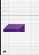
Я установил Height = "{TemplateBinding Height}" для сетки LayoutRoot, затем вы можете применить этот стиль к своему NavigationViewItem следующим образом:
<NavigationViewItem Style = "{StaticResource test}">
    <Image Source = "/Assets/Cubes/purple.png" HorizontalAlignment = "Center" MinHeight = "100" MinWidth = "100"></Image>
</NavigationViewItem>
Извините, не проверял. Это работает так, как хотелось бы, большое спасибо. Хотя я хочу отключить
OnItemInvoked(NavigationViewItemInvokedEventArgs args)только для этого образа. ПолучениеSystem.InvalidCastException: 'Unable to cast object of type 'Windows.UI.Xaml.Controls.Image' to type 'System.String'.'