Почему flex дает ширину элемента hr равной 0?
Когда я пытаюсь поместить элемент hr в контейнер с display: flex, он исчезает. (Если я удалю display: flex, он появится снова, поэтому я уверен, что это причина.)
Я читал на Сообщение блога, что изгиб приводит к тому, что hr имеет нулевую ширину, что я подтвердил, дав ему ширину 100% (заставляя его снова появляться), но никаких объяснений не было дано.
Из любопытства (я просто положил hr за пределы гибкого контейнера, чтобы решить проблему), почему это происходит? Приведет ли использование flexbox к исчезновению других случайных элементов?
Я не думаю, что что-то еще в моем коде вызывает это, но вот мой полный код на всякий случай:
* {
  /* Makes width and height include padding, border */
  box-sizing: border-box;
}

body {
  font-family: "Quicksand", sans-serif;
  margin: 0;
}

h1,
h2,
h3,
h4,
h5,
h6 {
  color: #2d3c49;
  text-transform: uppercase;
}

h1 {
  font-weight: 200;
  /* Browsers typically display h1 as 2em */
  font-size: 2.6em;
  margin-bottom: 0;
}


/* Adds a bit of space above subtitle (set h1 bottom margin to 0) */

header h4 {
  margin-top: 7px;
}


/* Top content */

header {
  display: flex;
  max-width: 1000px;
  margin: 0 auto;
  margin-top: 1em;
  /* Vertically centers logo  */
  align-items: center;
}


/* logo img */

.logo {
  height: 90px;
  width: auto;
  margin-right: auto;
}


/* Only subtitle isn't aligned all the way to the right; this fixes it. TODO: figure out why doesn't apply to h1 text */

.header-text {
  display: flex;
  justify-content: flex-end;
}

hr {
  background-color: #7d97ad;
  max-width: 1000px;
  margin-bottom: 1em;
  border: none;
  height: 3px;
}

.main-image {
  max-width: 1000px;
  height: auto;
}


/* Applies to content within <main> element (excludes header, footer) */

.container {
  display: flex;
  flex-direction: column;
  align-items: center;
  justify-content: center;
  max-width: 1000px;
  margin: 0 auto;
}


/* Applies to project section (including header text) */

.container-projects {
  display: flex;
  /* Parent container needs this for flex-item to take full width in row */
  flex-wrap: wrap;
  flex-direction: row;
  justify-content: space-between;
  margin: 2em 0;
}

.portfolio-header {
  /* Puts header in its own row without removing from container with row flex direction (setting parent container to wrap also required) */
  width: 100%;
  text-align: left;
  color: #7d97ad;
}


/* Div containing single project's title, image, text */


/* TODO: add declarations */

.project {
  width: 300px;
  height: auto;
}

.project p,
h3 {
  text-align: center;
}


/* Images cropped with 3:2 ratio, scaled resolution down to 600 x 400 */

.project-image {
  width: 300px;
  height: auto;
}

footer {
  text-align: center;
  margin-top: 1em;
  background-color: #ccc;
  color: white;
  padding: 2em;
  font-size: 1.1em;
}


/* Remove default 1em margin-top */

footer p {
  margin-top: 0;
}


/* Applies to Font Awesome social icons */

.fab {
  margin: 0 0.5em;
  color: white;
}


/* Changes social icon color to dark grey on hover */

.fab:hover {
  color: #2d3c49;
}


/* Media queries (breakpoints correspond to Bootstrap breakpoints). 1rem = 16px */


/* Small devices (landscape phones) */

@media screen and (max-width: 767px) {
  h1 {
    font-size: 2em;
  }
  h2 {
    font-size: 1.5em;
  }
  h3 {
    font-size: 1.3em;
  }
  h4 {
    font-size: 1.1em;
  }
  /* Doesn't seem to be doing anything TODO: find out why   */
  .portfolio-header {
    margin-bottom: 1em;
  }
  /* TODO: make slightly wider  */
  .container-projects {
    margin: 1.5em 0 0 0;
  }
  header {
    margin: 0 1em 0 0;
  }
  header,
  .container,
  footer {
    max-width: 100%;
  }
  /* Must specify max-width for img even though parent .container has the same declaration because max-width isn't inherited */
  .container img {
    max-width: 100%;
  }
  .project {
    /* Centers projects (aligned left otherwise) */
    margin: 0 auto;
  }
  /* Aligns portfolio header text flush left of portfolio rows */
  .portfolio-header {
    width: 300px;
    margin: 10px auto;
  }
  .logo {
    height: 50px;
    width: auto;
  }
}


/* Tablets */

@media screen and (max-width: 991px) {
  h1 {
    font-size: 1.7rem;
  }
}


/* Small laptops */

@media screen and (max-width: 1199px) {
  h1 {
    font-size: 2rem;
  }
}
<header>
<img src = "https://image.ibb.co/jVeP4S/udacity_logo.png" alt = "Udacity logo" class = "logo">
<!-- Header is set to display: flex, and it only works on direct children. Without the div, its default row alignment puts header text side by side, but inside a div, it works on the div as a block and since header text items are no longer direct children, it has no effect on them -->
<div>
<h1>Natalie Cardot</h1>
<h4 class = "header-text">Front-End Web Developer</h4>
</div>
</header>
<!-- TODO: put inside main? But makes it disappear -->
<main class = "container">
<hr>
<img src = "https://image.ibb.co/cTcuM7/using_laptop_large.jpg" alt = "Woman using laptop at home during the day" class = "main-image">
<section class = "container-projects">
<h2 class = "portfolio-header">Featured Work</h2>
<div class = "project">
<img class = "project-image" src = "https://image.ibb.co/hv4c8n/santorini_small.jpg" alt = "View from island of Santorini on a sunny day">
<h3>Project No. 1</h3>
<p>Lorem ipsum dolor sit amet, consectetur adipiscing elit.</p>
</div>
<div class = "project">
<img class = "project-image" src = "https://image.ibb.co/c9sKM7/coast_small.jpg" alt = "Distant view of a rugged island with a sailboat nearby">
<h3>Project No. 2</h3>
<p>Lorem ipsum dolor sit amet, consectetur adipiscing elit.</p>
</div>
<div class = "project">
<img class = "project-image" src = "https://image.ibb.co/eO9oES/mediterranean_small.jpg" alt = "Bird's eye view of a rocky beach with clear turquoise waters">
<h3>Project No. 3</h3>
<p>Lorem ipsum dolor sit amet, consectetur adipiscing elit.</p>
</div>
</section>
<!-- End of container-project -->
</main>
<footer>
<p>Created by me</p>
<!-- "fab" prefix new in Font Awesome version 5 (released 3/18) -->
<a href = "https://github.com/nataliecardot" target = "_blank"><i class = "fab fa-github fa-lg"></i></a>
<a href = "https://codepen.io/nataliecardot/"><i class = "fab fa-codepen fa-lg"></i></a>
<a href = "https://twitter.com/nataliecardot/"><i class = "fab fa-twitter fa-lg"></i></a>
<a href = "https://www.linkedin.com/in/natalie-cardot/" target = "_blank"><i class = "fab fa-linkedin-in fa-lg"></i></a>
</footer>


Ответы 2
Flex разрывает поля margin-left: auto и margin-right: auto тега HR. Попробуйте добавить это в свой CSS.
hr {margin-left:0;margin-right:0}
Элемент hr имеет стили по умолчанию, установленные браузером. Например, вот что делает Chrome:
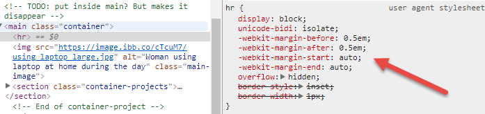
В гибком контейнере поля auto занимают все свободное пространство в направлении поля.
Таким образом, -webkit-margin-start: auto (в LTR, эквивалент margin-left: auto) и -webkit-margin-end: auto (в LTR, эквивалент margin-right: auto) занимают все свободное пространство слева и справа от элемента hr, сжимая его до width: 0 (поскольку внутри нет содержимого).
Вы можете переопределить эти поля auto с помощью width: 100%. Но, вероятно, более эффективно просто заменить margin: auto на margin: 0.
Но даже тогда, в этом случае, как только вы удалите поля auto, align-items: center сработает с родительским.

Это отменяет значение по умолчанию align-items: stretch и делает то же самое, что и левое / правое поля auto. Опять же, hr сжат до width: 0.
Итак, внесите эти две корректировки в свое правило hr:
hr {
  margin: 0;
  align-self: stretch;
}
* {
  /* Makes width and height include padding, border */
  box-sizing: border-box;
}

body {
  font-family: "Quicksand", sans-serif;
  margin: 0;
}

h1,
h2,
h3,
h4,
h5,
h6 {
  color: #2d3c49;
  text-transform: uppercase;
}

h1 {
  font-weight: 200;
  /* Browsers typically display h1 as 2em */
  font-size: 2.6em;
  margin-bottom: 0;
}


/* Adds a bit of space above subtitle (set h1 bottom margin to 0) */

header h4 {
  margin-top: 7px;
}


/* Top content */

header {
  display: flex;
  max-width: 1000px;
  margin: 0 auto;
  margin-top: 1em;
  /* Vertically centers logo  */
  align-items: center;
}


/* logo img */

.logo {
  height: 90px;
  width: auto;
  margin-right: auto;
}


/* Only subtitle isn't aligned all the way to the right; this fixes it. TODO: figure out why doesn't apply to h1 text */

.header-text {
  display: flex;
  justify-content: flex-end;
}

hr {
  background-color: #7d97ad;
  max-width: 1000px;
  /* margin-bottom: 1em; */
  border: none;
  height: 3px;
  margin: 0 0 1em 0;    /* NEW */
  align-self: stretch;  /* NEW */
}

.main-image {
  max-width: 1000px;
  height: auto;
}


/* Applies to content within <main> element (excludes header, footer) */

.container {
  display: flex;
  flex-direction: column;
  align-items: center;
  justify-content: center;
  max-width: 1000px;
  margin: 0 auto;
}


/* Applies to project section (including header text) */

.container-projects {
  display: flex;
  /* Parent container needs this for flex-item to take full width in row */
  flex-wrap: wrap;
  flex-direction: row;
  justify-content: space-between;
  margin: 2em 0;
}

.portfolio-header {
  /* Puts header in its own row without removing from container with row flex direction (setting parent container to wrap also required) */
  width: 100%;
  text-align: left;
  color: #7d97ad;
}


/* Div containing single project's title, image, text */


/* TODO: add declarations */

.project {
  width: 300px;
  height: auto;
}

.project p,
h3 {
  text-align: center;
}


/* Images cropped with 3:2 ratio, scaled resolution down to 600 x 400 */

.project-image {
  width: 300px;
  height: auto;
}

footer {
  text-align: center;
  margin-top: 1em;
  background-color: #ccc;
  color: white;
  padding: 2em;
  font-size: 1.1em;
}


/* Remove default 1em margin-top */

footer p {
  margin-top: 0;
}


/* Applies to Font Awesome social icons */

.fab {
  margin: 0 0.5em;
  color: white;
}


/* Changes social icon color to dark grey on hover */

.fab:hover {
  color: #2d3c49;
}


/* Media queries (breakpoints correspond to Bootstrap breakpoints). 1rem = 16px */


/* Small devices (landscape phones) */

@media screen and (max-width: 767px) {
  h1 {
    font-size: 2em;
  }
  h2 {
    font-size: 1.5em;
  }
  h3 {
    font-size: 1.3em;
  }
  h4 {
    font-size: 1.1em;
  }
  /* Doesn't seem to be doing anything TODO: find out why   */
  .portfolio-header {
    margin-bottom: 1em;
  }
  /* TODO: make slightly wider  */
  .container-projects {
    margin: 1.5em 0 0 0;
  }
  header {
    margin: 0 1em 0 0;
  }
  header,
  .container,
  footer {
    max-width: 100%;
  }
  /* Must specify max-width for img even though parent .container has the same declaration because max-width isn't inherited */
  .container img {
    max-width: 100%;
  }
  .project {
    /* Centers projects (aligned left otherwise) */
    margin: 0 auto;
  }
  /* Aligns portfolio header text flush left of portfolio rows */
  .portfolio-header {
    width: 300px;
    margin: 10px auto;
  }
  .logo {
    height: 50px;
    width: auto;
  }
}


/* Tablets */

@media screen and (max-width: 991px) {
  h1 {
    font-size: 1.7rem;
  }
}


/* Small laptops */

@media screen and (max-width: 1199px) {
  h1 {
    font-size: 2rem;
  }
}
<header>
<img src = "https://image.ibb.co/jVeP4S/udacity_logo.png" alt = "Udacity logo" class = "logo">
<!-- Header is set to display: flex, and it only works on direct children. Without the div, its default row alignment puts header text side by side, but inside a div, it works on the div as a block and since header text items are no longer direct children, it has no effect on them -->
<div>
<h1>Natalie Cardot</h1>
<h4 class = "header-text">Front-End Web Developer</h4>
</div>
</header>
<!-- TODO: put inside main? But makes it disappear -->
<main class = "container">
<hr>
<img src = "https://image.ibb.co/cTcuM7/using_laptop_large.jpg" alt = "Woman using laptop at home during the day" class = "main-image">
<section class = "container-projects">
<h2 class = "portfolio-header">Featured Work</h2>
<div class = "project">
<img class = "project-image" src = "https://image.ibb.co/hv4c8n/santorini_small.jpg" alt = "View from island of Santorini on a sunny day">
<h3>Project No. 1</h3>
<p>Lorem ipsum dolor sit amet, consectetur adipiscing elit.</p>
</div>
<div class = "project">
<img class = "project-image" src = "https://image.ibb.co/c9sKM7/coast_small.jpg" alt = "Distant view of a rugged island with a sailboat nearby">
<h3>Project No. 2</h3>
<p>Lorem ipsum dolor sit amet, consectetur adipiscing elit.</p>
</div>
<div class = "project">
<img class = "project-image" src = "https://image.ibb.co/eO9oES/mediterranean_small.jpg" alt = "Bird's eye view of a rocky beach with clear turquoise waters">
<h3>Project No. 3</h3>
<p>Lorem ipsum dolor sit amet, consectetur adipiscing elit.</p>
</div>
</section>
<!-- End of container-project -->
</main>
<footer>
<p>Created by me</p>
<!-- "fab" prefix new in Font Awesome version 5 (released 3/18) -->
<a href = "https://github.com/nataliecardot" target = "_blank"><i class = "fab fa-github fa-lg"></i></a>
<a href = "https://codepen.io/nataliecardot/"><i class = "fab fa-codepen fa-lg"></i></a>
<a href = "https://twitter.com/nataliecardot/"><i class = "fab fa-twitter fa-lg"></i></a>
<a href = "https://www.linkedin.com/in/natalie-cardot/" target = "_blank"><i class = "fab fa-linkedin-in fa-lg"></i></a>
</footer>Обратите внимание, что поля гибкого auto имеют приоритет над свойствами выравнивания ключевых слов (такими как justify-content и align-items). Если задано поле auto, оно применяется в первую очередь, занимая все свободное пространство в строке. align-items идет вторым, но свободного места не остается, поэтому он ничего не может сделать.
Вот почему в приведенном выше коде align-items ничего не делает, пока поля auto не будут удалены.
8.1. Aligning with
automarginsPrior to alignment via
justify-contentandalign-self, any positive free space is distributed toautomargins in that dimension.If free space is distributed to
automargins, the alignment properties will have no effect in that dimension because the margins will have stolen all free space left over after flexing.
Подробнее о полях гибкого диска auto:
У меня была похожая проблема. При помещении
hrв гибкий контейнер с заданным направлением столбца высота будет равна 0 даже при примененииmargin: 0. Решение, которое я нашел, - вместо того, чтобы устанавливатьheight, нужно установитьmin-heightдляhr. Также я должен упомянуть, что уhrустановлен цвет фона (градиент) и что у него нет границы.