Почему содержимое HTML, CSS и JavaScript смещается вправо на моем телефоне (на разных платформах)?
Телефонный контент
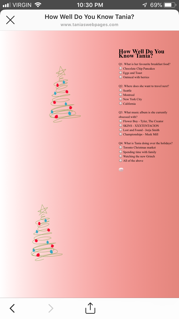
Прикрепленное изображение - это скриншот того, как выглядит моя веб-страница https://www.taniaswebpages.com. Все сдвинуто вправо.
Когда я работаю над этой страницей в скобках, мой контент как бы центрирован, но в основном слева, а два дерева находятся справа. Я занимаюсь веб-сайтом 180 дней и борюсь. Надеюсь, что кто-то может мне помочь, так как я новичок в этом кодировании. Когда я просматриваю веб-страницу на своем телефоне, содержимое начинает складываться странным образом.
это мой html:
<!DOCTYPE HTML>
<html lang = "en" dir = "ltr">

<meta name = "viewport" content = "width=device-width,height=device-height,initial-scale=1.0"/>
<meta charset = "utf-8">


<link href = "taniaWebsite2.css" type = "text/css" rel = "Stylesheet" />
<title> How Well Do You Know Tania?</title>


<body class = "mainpage3">


<h1> How Well Do You Know Tania?</h1>

<form name = "Questionaire">

Q1. What is her favourite breakfast food? <br>
    <input type = "radio" name = "q1" value = "a"> Chocolate Chip Pancakes <br>
    <input type = "radio" name = "q1" value = "b"> Eggs and Toast <br>
     <input type = "radio" name = "q1" value = "c"> Oatmeal with berries <br><br>

Q2. Where does she want to travel next?<br>
    <input type = "radio" name = "q2" value = "a"> Seattle <br>
    <input type = "radio" name = "q2" value = "b"> Montreal <br>
     <input type = "radio" name = "q2" value = "c"> New York City <br>
      <input type = "radio" name = "q2" value = "d"> California <br><br>

Q3. What music album is she currently obsessed with?<br>
    <input type = "radio" name = "q3" value = "a"> Flower Boy - Tyler, The Creator <br>
    <input type = "radio" name = "q3" value = "b"> SKINS - XXXTENTACION <br>
     <input type = "radio" name = "q3" value = "c"> Lost and Found - Jorja Smith  <br>
      <input type = "radio" name = "q3" value = "d"> Championships - Meek Mill <br><br>

Q4. What is Tania doing over the holidays?<br>
     <input type = "radio" name = "q4" value = "a"> Toronto Christmas market <br>
    <input type = "radio" name = "q4" value = "b"> Spending time with family <br>
     <input type = "radio" name = "q4" value = "c"> Watching the new Grinch   <br>
      <input type = "radio" name = "q4" value = "d"> All of the above <br><br>


<input type = "button" value = "Submit" onclick = "check()">


</form>

<script>

function check(){
    var q1=document.Questionaire.q1.value;
    var q2=document.Questionaire.q2.value;
    var q3=document.Questionaire.q3.value;
    var q4=document.Questionaire.q4.value;
    var count=0;

    if (q1= = "a"){
        count++;

    }if (q2= = "c"){
        count++;

    }if (q3= = "a"){
        count++;
    }if (q4= = "d"){
        count++;

    }alert("You received "+count+" out of 4");


}

</script>


 <img src = "tree.png" class = "image1" width=200 height=350 >
 <img src = "tree2.png" class = "image2" width=200 height=350 >


</body>

</html>
это мой css:
body.mainpage2{
margin:0;
padding:0;
font-family:lato;
background-color:#e74c3c;
}


.color{
margin-top:350px;
text-align:center;
}

 #hex{
display:block;
color:white;
font-size:40px;
text-transform: uppercase;
margin:15px;
letter-spacing: 0.1em;
}

.color button{
background:none;
outline:none;
color:white;
border:2px solid white;
cursor:pointer;
font-size:22px;
border-radius: 5px;
box-shadow: 5px 6px 30px 5px #fff;
width:200px;

}

body.mainpage3{
background-image: linear-gradient(to right, rgba(255,0,0,0), rgba(221, 106, 95, 0.81));
margin: 0 auto;
max-width: 800px;
padding: 2em 2em 4em;
font-family:Lato;
font-size:16.5px;
line-height: 24px;
float;align-content: flex-start;
display: block;


}

input[type=button]{
width:8%;
border:none;
padding: 8px 8px;
cursor:pointer;
color:palevioletred;

}

 .image1 {

position: relative;
right:-400px;
bottom:600px;
animation: shake 0.9s;
 animation-iteration-count: infinite;


}

.image2{
position:relative;
right:-100px;
bottom:200px;
animation: shake 0.9s;
animation-iteration-count: infinite;

}


 @keyframes shake {
  0% { transform: translate(1px, 1px) rotate(0deg); }
  10% { transform: translate(-1px, -2px) rotate(-1deg); }
  20% { transform: translate(-3px, 0px) rotate(1deg); }
  30% { transform: translate(3px, 2px) rotate(0deg); }
  40% { transform: translate(1px, -1px) rotate(1deg); }
  50% { transform: translate(-1px, 2px) rotate(-1deg); }
  60% { transform: translate(-3px, 1px) rotate(0deg); }
  70% { transform: translate(3px, 1px) rotate(-1deg); }
  80% { transform: translate(-1px, -1px) rotate(1deg); }
  90% { transform: translate(1px, 2px) rotate(0deg); }
  100% { transform: translate(1px, -2px) rotate(-1deg); }
 }


![Безумие обратных вызовов в javascript [JS]](https://i.imgur.com/WsjO6zJb.png)


Ответы 2
Похоже, этого не происходит ни на моем мобильном телефоне, ни в веб-браузере. Так, может быть, вам нужно очистить кеш / файлы cookie?
Если вы хотите, чтобы изображения были встроены в текст, изображения по умолчанию имеют дисплей: встроенный;. Возможно, вы захотите поместить изображение в теги абзаца <p><img src = "" class = "myImage"></p>, а затем для мобильных устройств вы можете использовать ясно: оба; в своем CSS для изображений. Что-то вроде этого:
.myImages {
    clear: both;
}
Примечание: Присвоение изображениям точных значений вправо: -400 пикселей; и внизу: 600 пикселей; в CSS, как я вижу на вашей странице, применимо и к мобильным устройствам. Какой размер экрана на самом деле не подходит для отображения для вашего использования.
Также,
Я вижу, вы используете ширина: 8%; для своей кнопки отправки. Но на мобильных устройствах уменьшение размера кнопки до 8% от доступного размера приводит к сокращению половины кнопки и текста. Вместо этого я бы использовал фиксированную ширину. Что-то вроде ширина: 100 пикселей;, которое сохранит свой истинный размер. Или, как многие другие сейчас, для мобильных устройств вы можете использовать следующее:
@media (max-width: 768px) {
     input[type=button] {
          width:100%;
     }
}
Это сделает ширину кнопки 100% доступной ширины, в то время как размер экрана не превышает 768 пикселей.
Измените свой CSS-код для .image - вот так:
 .image1, .image2 {
   position: absolute; /* necessary for absolute position... dont use relative */
   right:0; /* two trees are on the right side */
   animation: shake .9s infinite /* shorthand animation property */
 }
 .image1{top:0}
 .image2{top:350}
А на устройствах с маленьким экраном вы можете использовать этот код (увидеть ниже), чтобы изображения не выходили за пределы содержимого сайта.
 @media (max-width: 700px) {
   .image1,.image2 {
     position:relative; /* relative to the normal flow */
     top:0; /* to reset the .image2 top value */
     margin:auto; /* to center the images */
     display:block /* block images optional */
   }
 }