Проблемы z-index с модальным блоком HTML и CSS
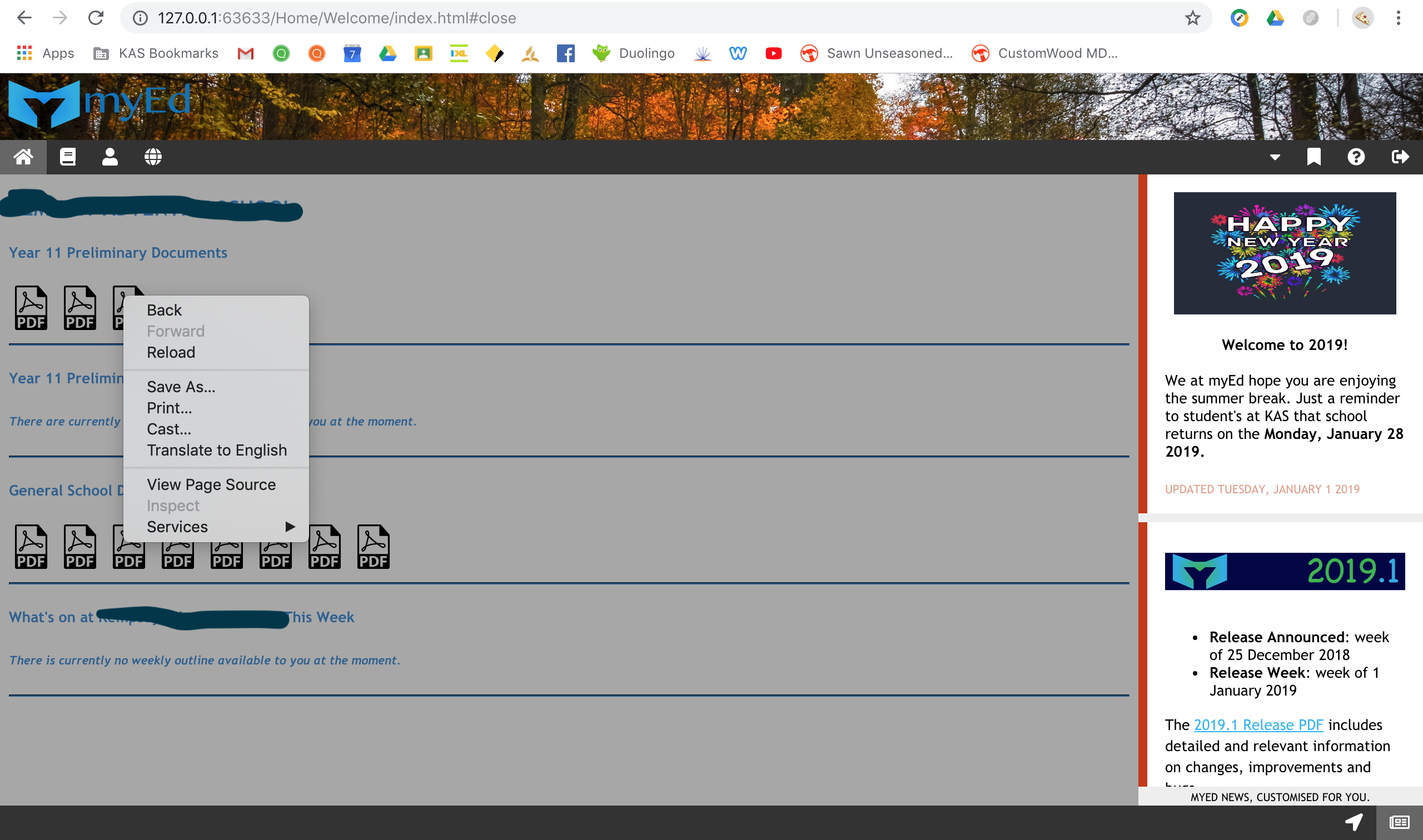
Мне пришлось поместить z-index = -1 в .main, поскольку модальные поля не отображались, как сейчас. Раздел .main со встроенным iFrame .frameMain не доступен для кликов и не может переходить по ссылкам внутри iFrame.
Я знаю, что проблема связана с z-index = 1, и если я удалю его, раздел .main будет работать, а модальные поля - нет.
Есть ли альтернативный способ, чтобы оба результата работали?
Прилагаю мой HTML, CSS и скриншоты проблем.
body {
	/* General Body Properties */
	 font-family: Trebuchet MS, Georgia, Helvetica, sans-serif;
	 margin: 0;
	 overflow: hidden;
}
 * {
	/* Key element to aligning <divs> (DO NOT REMOVE) */
	 box-sizing: border-box;
}
 #wrapper {
	 bottom: 0;
	 left: 0;
	 overflow: hidden;
	 position: absolute;
	 right: 0;
	 top: 0
}
 .header {
	/* Header properties featuring myEd and school emblems */
	 padding: 30px;
	 text-align: center;
	/* Aligns links in the navBar */
	 background-image: url(/Default/Img/backgroundHeader-4K.jpg);
	 background-size: cover;
	 background-repeat: no-repeat;
}
 .myEd-reverse {
	 width: 240px;
	 height: 70px;
	 float: left;
	 margin-left: -60px;
	 margin-top: -40px;
}
 .navBar {
	/* Sticky navBar, either relative or fixed, depending on the scroll position of the site */
	 overflow: hidden;
	 background-color: #333;
	 position: sticky;
	 position: -webkit-sticky;
	 top: 0;
}
 .navBar a {
	/* Style the navBar links */
	 float: left;
	 display: block;
	 color: #fff;
	 text-align: center;
	 padding: 6px 12px;
	 text-decoration: none;
}
 .navBar a.right {
	/* Float Quick Links, Help and Log-out navBar directory items to the right of the navBar */
	 float: right;
}
 .navBar a:hover {
	/* Change color on hover */
	 background-color: #ddd;
	 color: #000;
}
 .navBar a.active {
	/* Active Link */
	 background-color: #666;
	 color: #fff;
}
 .modalDialog {
	/* Modal Properties for all modals in myEd */
	 position: fixed;
	 font-family: Trebuchet MS, Georgia, Helvetica, sans-serif;
	 top: 0;
	 right: 0;
	 bottom: 0;
	 left: 0;
	 background: rgba(0,0,0,0.8);
	 z-index: 99999;
	 opacity:0;
	 -webkit-transition: opacity 400ms ease-in;
	 -moz-transition: opacity 400ms ease-in;
	 transition: opacity 400ms ease-in;
	 pointer-events: none;
}
 .modalDialog:target {
	/* Modal Properties for all modals in myEd */
	 opacity:1;
	 pointer-events: auto;
}
 .modalDialog > div {
	/* Modal Properties for all modals in myEd */
	 width: 400px;
	 position: relative;
	 margin: 10% auto;
	 padding: 5px 20px 13px 20px;
	 border-radius: 10px;
	 background: #fff;
	 background: -moz-linear-gradient(#fff, #999);
	 background: -webkit-linear-gradient(#fff, #999);
	 background: -o-linear-gradient(#fff, #999);
}
 .close {
	/* Modal Properties for all modals in myEd */
	 background: #606061;
	 color: #FFFFFF;
	 line-height: 10px;
	 position: absolute;
	 right: -5px;
	 text-align: center;
	 top: -10px;
	 width: -5px;
	 text-decoration: none;
	 font-weight: bold;
	 -webkit-border-radius: 12px;
	 -moz-border-radius: 12px;
	 border-radius: 12px;
	 -moz-box-shadow: 1px 1px 3px #000;
	 -webkit-box-shadow: 1px 1px 3px #000;
	 box-shadow: 1px 1px 3px #000;
}
 .close:hover {
	 background: #00d9ff;
}
/* Modal Properties for all modals in myEd */
 .row {
	/* Alignment between sideBar and main */
	 display: -ms-flexbox;
	 display: flex;
	 -ms-flex-wrap: wrap;
	 flex-wrap: wrap;
}
 .sideBar {
	/* sideBar alignment properties */
	 -ms-flex: 20%;
	 flex: 20%;
	 background-color: #a7a7a7;
	 padding: 0px;
	 height: 5000px;
	/* As standard to work on all screen resolutions, overflow hides excess */
	 overflow-y: scroll;
	/* Allows myEd news to scroll */
	 overflow: hidden;
}
 #newsmyEd {
	 width: 100%;
	 height: 11.4%;
	 min-height: 11.4%;
	 top: 0;
	 right: 0;
}
 .main {
	/* Main Column */
	 -ms-flex: 80%;
	 flex: 80%;
	 background-color: #a7a7a7;
	 padding: 0px;
	 height: 5000px;
	/* As standard to work on all screen resolutions, overflow hides excess */
	 overflow-y: scroll;
	/* Allows embedded iFrame to scroll */
	 position: relative;
	 overflow: hidden;
	 z-index: -1;
}
 .frameMain {
	/* Frame Properties */
	 position: absolute;
	 top: 0;
	 left: 0;
	 border: 0;
	 min-height: 11.4%;
}
 .footer {
	/* Footer properties */
	 position: fixed;
	 bottom: 0;
	 left: 0;
	 right: 0;
	 background-color: #333;
}
 .footer a {
	/* Footer navBar properties */
	 float: right;
	 display: block;
	 color: #fff;
	 text-align: center;
	 padding: 6px 12px;
	 text-decoration: none;
}
 .footer a:hover {
	/* Change color on hover */
	 background-color: #ddd;
	 color: #000;
}
 .footer a.active {
	/* Active Link */
	 background-color: #666;
	 color: #fff;
}
 @media screen and (max-width: 700px) {
	/* Responsive Layout - If screen px is less than 700px, make sideBar and main stack on top of each other */
	 .row {
		 flex-direction: column;
	}
}
 @media screen and (max-width: 400px) {
	/* Responsive Layout - If screen px is less than 400px, make navBar links stack vertically on top of each other */
	 .navBar a {
		 float: none;
		 width: 100%;
	}
}
<!DOCTYPE HTML>
<!-- Copyright (c) myEd (made by students, for students.) 2018. -->
<html lang = "en">
<head>
<title>Welcome | myEd</title>
<meta charset = "UTF-8">
<meta name = "viewport" content = "width=device-width, initial-scale=1.0">
<link rel = "stylesheet" type = "text/css" href = "/Home/Welcome/Style/style.css">
<link rel = "stylesheet" href = "https://use.fontawesome.com/releases/v5.4.1/css/all.css" integrity = "sha384-5sAR7xN1Nv6T6+dT2mhtzEpVJvfS3NScPQTrOxhwjIuvcA67KV2R5Jz6kr4abQsz" crossorigin = "anonymous">
<link rel = "shortcut icon" href = "/Default/Img/faviconmyEd-16x16.png">
</head>
<body>
<script> // Required scripts for certain activities on myEd, each entry will be noted for understanding
document.getElementsByClassName("main")[0];
</script>
<div id = "wrapper"> <!-- Wrapper fitting website to all screen resolutions -->
<div class = "header"> <!-- Header featuring 4K Background, myEd and school emblems -->
<img src = "/Default/Img/myEd-reverse.png" class = "myEd-reverse" alt = "myEd" title = "myEd Software"> <!-- myEd Software -->
</div>
<div class = "navBar"> <!-- Main sticky navBar with categories listed -->
<a href = "#" class = "active" title = "Home Workspace"><i class = "fa fa-home"></i></a> <!-- Home -->
<a href = "#" title = "Learning Workspace"><i class = "fa fa-book"></i></a> <!-- Learning -->
<a href = "#" title = "Student Management Workspace"><i class = "fa fa-user"></i></a> <!-- Student Management -->
<a href = "#" title = "Portal Workspace"><i class = "fa fa-globe"></i></a> <!-- Portals -->
<a href = "#" class = "right" title = "Log-out"><i class = "fas fa-sign-out-alt"></i></a> <!-- Log-out (right to left) -->
<a href = "#" class = "right" title = "Help"><i class = "fa fa-question-circle"></i></a> <!-- Help (right to left) -->
<a href = "#modalQL" class = "right" title = "Quick Links"><i class = "fa fa-bookmark"></i></a> <!-- Quick Links (right to left) -->
<div id = "modalQL" class = "modalDialog">
<div>
<a href = "#close" title = "Close Quick Links" class = "close">X</a>
<h3>Quick Links</h3>
<h6><a href = "https://kempsey.cs.adventist.edu.au/" target = "_blank" rel = "noopener" title = "Click Here to be redirected to SEQTA Learn">SEQTA Learn</a></h6>
<h6><a href = "https://kempsey.cp.adventist.edu.au/" target = "_blank" rel = "noopener" title = "Click Here to be redirected to SEQTA Engage">SEQTA Engage</a></h6>
<h6><a href = "https://www.adventist.edu.au" target = "_blank" rel = "noopener" title = "Click Here to be redirected to ASA">Adventist Schools Australia</a></h6>
<br>
<h6><em>The links above are not available via the Portal Pages of myEd as they are unable to be embedded into the software.</em></h6>
</div>
</div>
<a href = "#modalPO" class = "right" title = "Profile Overview"><i class = "fas fa-caret-down"></i></a> <!-- Profile dropDown (right to left) -->
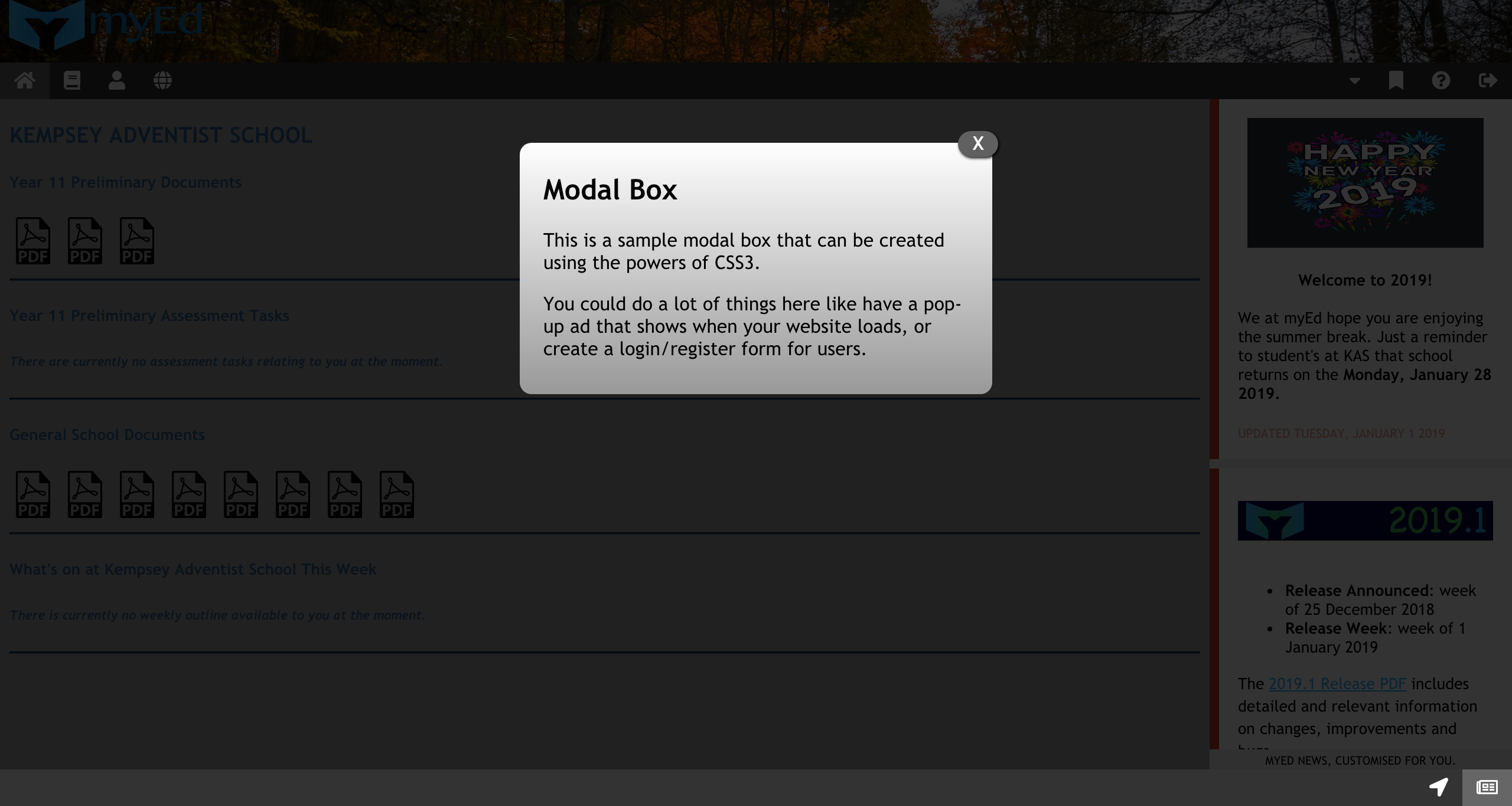
<div id = "modalPO" class = "modalDialog">
<div>
<a href = "#close" title = "Close Profile Overview" class = "close">X</a>
<h3>Modal Box</h3>
<p>This is a sample modal box that can be created using the powers of CSS3.</p>
<p>You could do a lot of things here like have a pop-up ad that shows when your website loads, or create a login/register form for users.</p>
</div>
</div>
</div>
<div class = "row"> <!-- Format for alignment of the sideBar and main panels -->
<div class = "main"> <!-- Main learning or collaborative workspace -->
<iframe class = "frameMain" width = "100%" height = "11.4%" scrolling = "yes" src = "/Home/Welcome/iFrame/index.html"></iframe> <!-- Embedded frame -->
</div>
<div class = "sideBar"> <!-- sideBar featuring Profile, myEd News and directory -->
<iframe id = "newsmyEd" frameborder = "0" src = "/Default/News/index.html"></iframe> <!-- myEd News -->
</div>
</div>
<div class = "footer"> <!-- Featuring Site Navigation and myEd News navBar links -->
<a href = "#" class = "active" title = "myEd News"><i class = "far fa-newspaper"></i></a> <!-- myEd News -->
<a href = "/Home/Welcome/siteNavigation/index.html" title = "Site Navigation"><i class = "fa fa-location-arrow"></i></a> <!-- Site Navigation -->
</div>
</div>
</body>
</html>Спасибо за вашу помощь. Том


Ответы 1
Да, этого можно добиться, если .navBar { z-index: 100000; }
.main {
    /* Main Column */
    -ms-flex: 80%;
    flex: 80%;
    background-color: #a7a7a7;
    padding: 0px;
    height: 5000px;
    /* As standard to work on all screen resolutions, overflow hides excess */
    overflow-y: scroll;
    /* Allows embedded iFrame to scroll */
    position: relative;
    overflow: hidden;
}
.navBar {
    /* Sticky navBar, either relative or fixed, depending on the scroll position of the site */
    overflow: hidden;
    background-color: #333;
    position: sticky;
    position: -webkit-sticky;
    top: 0;
    z-index: 100000;
}
Замена этих двух селекторов CSS исправляет модальные окна. Сообщите мне, работает ли это. Работаем на основе прикрепленного сниппета.
Работает, большое спасибо! Я забыл удалить z-index = -1 из .main. Спасибо за помощь, Шон!
Привет, @ user10341225, если этот или какой-либо ответ помог решить ваш вопрос, пожалуйста, примите его, нажав на галочку. Это показывает широкому сообществу, что вы нашли решение, и дает некоторую репутацию как автору, так и вам. Это не обязательно.
Просто это работало. Позвольте мне попробовать еще раз и опубликовать весь источник.