Пустое пространство внизу веб-страницы при низком разрешении браузера (макет CSS-Grid)
Я пытался сделать простой макет сайта с помощью CSS-Grid. Все работает нормально и отзывчиво, но когда я сворачиваю свой браузер до очень маленьких разрешений, появляются полосы прокрутки, и css-сетка перестает растягиваться по всей высоте страницы, вызывая пустое пространство внизу.
Чтобы понять, что я имею в виду, просто запустите фрагмент, который я вставил, так как он открывается в окне небольшой высоты. Я также загрузил фотографии того, как это отображается в моем браузере.
Как это выглядит на нормальной высоте:

Что происходит, когда я уменьшаю высоту:
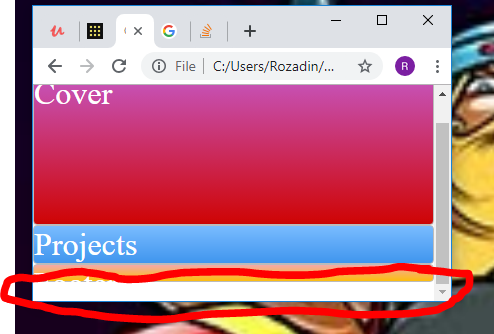
Я пробовал играть с overflow и min-height, но не смог. На самом деле это не критическая проблема, но мне действительно интересно просто понять, почему это происходит. Спасибо!
body, html{
  height: 100vh;
  min-height: 100vh;
  min-width: 300px;
  margin: 0;
  padding: 0;
}

.grid-container-1{
  height: 100vh;
  min-height: 100vh;
  min-width: 300px;
  margin: 0;
  padding: 0;
  display: grid;
  grid-template-columns: 1fr 1fr 1fr 1fr;
  grid-template-rows: 8% 70% auto 8% ;
  grid-template-areas:
  "header1 header1 header1 header1"
  "Cover Cover Cover Cover"
  "Project Project Project Project"
  "Footer Footer Footer Footer"
}

.header1{
  grid-area: header1;
}

.cover{
  grid-area: Cover;
}

.Project{
  grid-area: Project;
}

.Footer{
  grid-area: Footer;
}

.zone {
    cursor:pointer;
    color:#FFF;
    font-size:2em;
    border-radius:4px;
    border:1px solid #bbb;
    transition: all 0.3s linear;
}

.zone:hover {
    -webkit-box-shadow:rgba(0,0,0,0.8) 0px 5px 15px, inset rgba(0,0,0,0.15) 0px -10px 20px;
    -moz-box-shadow:rgba(0,0,0,0.8) 0px 5px 15px, inset rgba(0,0,0,0.15) 0px -10px 20px;
    -o-box-shadow:rgba(0,0,0,0.8) 0px 5px 15px, inset rgba(0,0,0,0.15) 0px -10px 20px;
    box-shadow:rgba(0,0,0,0.8) 0px 5px 15px, inset rgba(0,0,0,0.15) 0px -10px 20px;
}

/*https://paulund.co.uk/how-to-create-shiny-css-buttons*/
/***********************************************************************
 *  Green Background
 **********************************************************************/
.green{
    background: #56B870; /* Old browsers */
    background: -moz-linear-gradient(top, #56B870 0%, #a5c956 100%); /* FF3.6+ */
    background: -webkit-gradient(linear, left top, left bottom, color-stop(0%,#56B870), color-stop(100%,#a5c956)); /* Chrome,Safari4+ */
    background: -webkit-linear-gradient(top, #56B870 0%,#a5c956 100%); /* Chrome10+,Safari5.1+ */
    background: -o-linear-gradient(top, #56B870 0%,#a5c956 100%); /* Opera 11.10+ */
    background: -ms-linear-gradient(top, #56B870 0%,#a5c956 100%); /* IE10+ */
    background: linear-gradient(top, #56B870 0%,#a5c956 100%); /* W3C */
}

/***********************************************************************
 *  Red Background
 **********************************************************************/
.red{
    background: #C655BE; /* Old browsers */
    background: -moz-linear-gradient(top, #C655BE 0%, #cf0404 100%); /* FF3.6+ */
    background: -webkit-gradient(linear, left top, left bottom, color-stop(0%,#C655BE), color-stop(100%,#cf0404)); /* Chrome,Safari4+ */
    background: -webkit-linear-gradient(top, #C655BE 0%,#cf0404 100%); /* Chrome10+,Safari5.1+ */
    background: -o-linear-gradient(top, #C655BE 0%,#cf0404 100%); /* Opera 11.10+ */
    background: -ms-linear-gradient(top, #C655BE 0%,#cf0404 100%); /* IE10+ */
    background: linear-gradient(top, #C655BE 0%,#cf0404 100%); /* W3C */
}

/***********************************************************************
 *  Yellow Background
 **********************************************************************/
.yellow{
    background: #F3AAAA; /* Old browsers */
    background: -moz-linear-gradient(top, #F3AAAA 0%, #febf04 100%); /* FF3.6+ */
    background: -webkit-gradient(linear, left top, left bottom, color-stop(0%,#F3AAAA), color-stop(100%,#febf04)); /* Chrome,Safari4+ */
    background: -webkit-linear-gradient(top, #F3AAAA 0%,#febf04 100%); /* Chrome10+,Safari5.1+ */
    background: -o-linear-gradient(top, #F3AAAA 0%,#febf04 100%); /* Opera 11.10+ */
    background: -ms-linear-gradient(top, #F3AAAA 0%,#febf04 100%); /* IE10+ */
    background: linear-gradient(top, #F3AAAA 0%,#febf04 100%); /* W3C */
}

/***********************************************************************
 *  Blue Background
 **********************************************************************/
.blue{
    background: #7abcff; /* Old browsers */
    background: -moz-linear-gradient(top, #7abcff 0%, #60abf8 44%, #4096ee 100%); /* FF3.6+ */
    background: -webkit-gradient(linear, left top, left bottom, color-stop(0%,#7abcff), color-stop(44%,#60abf8), color-stop(100%,#4096ee)); /* Chrome,Safari4+ */
    background: -webkit-linear-gradient(top, #7abcff 0%,#60abf8 44%,#4096ee 100%); /* Chrome10+,Safari5.1+ */
    background: -o-linear-gradient(top, #7abcff 0%,#60abf8 44%,#4096ee 100%); /* Opera 11.10+ */
    background: -ms-linear-gradient(top, #7abcff 0%,#60abf8 44%,#4096ee 100%); /* IE10+ */
    background: linear-gradient(top, #7abcff 0%,#60abf8 44%,#4096ee 100%); /* W3C */
}
<!DOCTYPE html>
<html>
<head>
<title>CSS Layout</title>
<link rel = "stylesheet" type = "text/css" href = "style.css">
</head>
<body>
<div class = "grid-container-1">
<div class = "header1 zone green">
Header
</div>
<div class = "cover zone red">
Cover
</div>
<div class = "Project zone blue">
Projects
</div>
<div class = "Footer zone yellow">
Footer
</div>
</div>
</body>
</html>


Ответы 2
Ваш шрифт слишком велик для высоты последней строки и выливается из контейнера.
Одно из решений — изменить размер последней строки на 1fr:
body, html{
  height: 100vh;
  min-height: 100vh;
  min-width: 300px;
  margin: 0;
  padding: 0;
}

.grid-container-1{
  height: 100vh;
  min-height: 100vh;
  min-width: 300px;
  margin: 0;
  padding: 0;
  display: grid;
  grid-template-columns: 1fr 1fr 1fr 1fr;
  grid-template-rows: 8% 70% auto 1fr;
  grid-template-areas:
  "header1 header1 header1 header1"
  "Cover Cover Cover Cover"
  "Project Project Project Project"
  "Footer Footer Footer Footer"
}

.header1{
  grid-area: header1;
}

.cover{
  grid-area: Cover;
}

.Project{
  grid-area: Project;
}

.Footer{
  grid-area: Footer;
}

.zone {
    cursor:pointer;
    color:#FFF;
    font-size:2em;
    border-radius:4px;
    border:1px solid #bbb;
    transition: all 0.3s linear;
}

.zone:hover {
    -webkit-box-shadow:rgba(0,0,0,0.8) 0px 5px 15px, inset rgba(0,0,0,0.15) 0px -10px 20px;
    -moz-box-shadow:rgba(0,0,0,0.8) 0px 5px 15px, inset rgba(0,0,0,0.15) 0px -10px 20px;
    -o-box-shadow:rgba(0,0,0,0.8) 0px 5px 15px, inset rgba(0,0,0,0.15) 0px -10px 20px;
    box-shadow:rgba(0,0,0,0.8) 0px 5px 15px, inset rgba(0,0,0,0.15) 0px -10px 20px;
}

/*https://paulund.co.uk/how-to-create-shiny-css-buttons*/
/***********************************************************************
 *  Green Background
 **********************************************************************/
.green{
    background: #56B870; /* Old browsers */
    background: -moz-linear-gradient(top, #56B870 0%, #a5c956 100%); /* FF3.6+ */
    background: -webkit-gradient(linear, left top, left bottom, color-stop(0%,#56B870), color-stop(100%,#a5c956)); /* Chrome,Safari4+ */
    background: -webkit-linear-gradient(top, #56B870 0%,#a5c956 100%); /* Chrome10+,Safari5.1+ */
    background: -o-linear-gradient(top, #56B870 0%,#a5c956 100%); /* Opera 11.10+ */
    background: -ms-linear-gradient(top, #56B870 0%,#a5c956 100%); /* IE10+ */
    background: linear-gradient(top, #56B870 0%,#a5c956 100%); /* W3C */
}

/***********************************************************************
 *  Red Background
 **********************************************************************/
.red{
    background: #C655BE; /* Old browsers */
    background: -moz-linear-gradient(top, #C655BE 0%, #cf0404 100%); /* FF3.6+ */
    background: -webkit-gradient(linear, left top, left bottom, color-stop(0%,#C655BE), color-stop(100%,#cf0404)); /* Chrome,Safari4+ */
    background: -webkit-linear-gradient(top, #C655BE 0%,#cf0404 100%); /* Chrome10+,Safari5.1+ */
    background: -o-linear-gradient(top, #C655BE 0%,#cf0404 100%); /* Opera 11.10+ */
    background: -ms-linear-gradient(top, #C655BE 0%,#cf0404 100%); /* IE10+ */
    background: linear-gradient(top, #C655BE 0%,#cf0404 100%); /* W3C */
}

/***********************************************************************
 *  Yellow Background
 **********************************************************************/
.yellow{
    background: #F3AAAA; /* Old browsers */
    background: -moz-linear-gradient(top, #F3AAAA 0%, #febf04 100%); /* FF3.6+ */
    background: -webkit-gradient(linear, left top, left bottom, color-stop(0%,#F3AAAA), color-stop(100%,#febf04)); /* Chrome,Safari4+ */
    background: -webkit-linear-gradient(top, #F3AAAA 0%,#febf04 100%); /* Chrome10+,Safari5.1+ */
    background: -o-linear-gradient(top, #F3AAAA 0%,#febf04 100%); /* Opera 11.10+ */
    background: -ms-linear-gradient(top, #F3AAAA 0%,#febf04 100%); /* IE10+ */
    background: linear-gradient(top, #F3AAAA 0%,#febf04 100%); /* W3C */
}

/***********************************************************************
 *  Blue Background
 **********************************************************************/
.blue{
    background: #7abcff; /* Old browsers */
    background: -moz-linear-gradient(top, #7abcff 0%, #60abf8 44%, #4096ee 100%); /* FF3.6+ */
    background: -webkit-gradient(linear, left top, left bottom, color-stop(0%,#7abcff), color-stop(44%,#60abf8), color-stop(100%,#4096ee)); /* Chrome,Safari4+ */
    background: -webkit-linear-gradient(top, #7abcff 0%,#60abf8 44%,#4096ee 100%); /* Chrome10+,Safari5.1+ */
    background: -o-linear-gradient(top, #7abcff 0%,#60abf8 44%,#4096ee 100%); /* Opera 11.10+ */
    background: -ms-linear-gradient(top, #7abcff 0%,#60abf8 44%,#4096ee 100%); /* IE10+ */
    background: linear-gradient(top, #7abcff 0%,#60abf8 44%,#4096ee 100%); /* W3C */
}
<!DOCTYPE html>
<html>
<head>
<title>CSS Layout</title>
<link rel = "stylesheet" type = "text/css" href = "style.css">
</head>
<body>
<div class = "grid-container-1">
<div class = "header1 zone green">
Header
</div>
<div class = "cover zone red">
Cover
</div>
<div class = "Project zone blue">
Projects
</div>
<div class = "Footer zone yellow">
Footer
</div>
</div>
</body>
</html>Когда область просмотра слишком мала для ваших заголовок и нижний колонтитул, ваш размер текста переполняется — в качестве быстрая починка вы можете добавить overflow: hidden к zone к решить на небольших экранах — см. демонстрацию ниже:
body, html{
  height: 100vh;
  min-height: 100vh;
  min-width: 300px;
  margin: 0;
  padding: 0;
}

.grid-container-1{
  height: 100vh;
  min-height: 100vh;
  min-width: 300px;
  margin: 0;
  padding: 0;
  display: grid;
  grid-template-columns: 1fr 1fr 1fr 1fr;
  grid-template-rows: 8% 70% auto 8% ;
  grid-template-areas:
  "header1 header1 header1 header1"
  "Cover Cover Cover Cover"
  "Project Project Project Project"
  "Footer Footer Footer Footer"
}

.header1{
  grid-area: header1;
}

.cover{
  grid-area: Cover;
}

.Project{
  grid-area: Project;
}

.Footer{
  grid-area: Footer;
}

.zone {
    cursor:pointer;
    color:#FFF;
    font-size:2em;
    border-radius:4px;
    border:1px solid #bbb;
    transition: all 0.3s linear;
    overflow: hidden; /* ADDED */
}

.zone:hover {
    -webkit-box-shadow:rgba(0,0,0,0.8) 0px 5px 15px, inset rgba(0,0,0,0.15) 0px -10px 20px;
    -moz-box-shadow:rgba(0,0,0,0.8) 0px 5px 15px, inset rgba(0,0,0,0.15) 0px -10px 20px;
    -o-box-shadow:rgba(0,0,0,0.8) 0px 5px 15px, inset rgba(0,0,0,0.15) 0px -10px 20px;
    box-shadow:rgba(0,0,0,0.8) 0px 5px 15px, inset rgba(0,0,0,0.15) 0px -10px 20px;
}

/*https://paulund.co.uk/how-to-create-shiny-css-buttons*/
/***********************************************************************
 *  Green Background
 **********************************************************************/
.green{
    background: #56B870; /* Old browsers */
    background: -moz-linear-gradient(top, #56B870 0%, #a5c956 100%); /* FF3.6+ */
    background: -webkit-gradient(linear, left top, left bottom, color-stop(0%,#56B870), color-stop(100%,#a5c956)); /* Chrome,Safari4+ */
    background: -webkit-linear-gradient(top, #56B870 0%,#a5c956 100%); /* Chrome10+,Safari5.1+ */
    background: -o-linear-gradient(top, #56B870 0%,#a5c956 100%); /* Opera 11.10+ */
    background: -ms-linear-gradient(top, #56B870 0%,#a5c956 100%); /* IE10+ */
    background: linear-gradient(top, #56B870 0%,#a5c956 100%); /* W3C */
}

/***********************************************************************
 *  Red Background
 **********************************************************************/
.red{
    background: #C655BE; /* Old browsers */
    background: -moz-linear-gradient(top, #C655BE 0%, #cf0404 100%); /* FF3.6+ */
    background: -webkit-gradient(linear, left top, left bottom, color-stop(0%,#C655BE), color-stop(100%,#cf0404)); /* Chrome,Safari4+ */
    background: -webkit-linear-gradient(top, #C655BE 0%,#cf0404 100%); /* Chrome10+,Safari5.1+ */
    background: -o-linear-gradient(top, #C655BE 0%,#cf0404 100%); /* Opera 11.10+ */
    background: -ms-linear-gradient(top, #C655BE 0%,#cf0404 100%); /* IE10+ */
    background: linear-gradient(top, #C655BE 0%,#cf0404 100%); /* W3C */
}

/***********************************************************************
 *  Yellow Background
 **********************************************************************/
.yellow{
    background: #F3AAAA; /* Old browsers */
    background: -moz-linear-gradient(top, #F3AAAA 0%, #febf04 100%); /* FF3.6+ */
    background: -webkit-gradient(linear, left top, left bottom, color-stop(0%,#F3AAAA), color-stop(100%,#febf04)); /* Chrome,Safari4+ */
    background: -webkit-linear-gradient(top, #F3AAAA 0%,#febf04 100%); /* Chrome10+,Safari5.1+ */
    background: -o-linear-gradient(top, #F3AAAA 0%,#febf04 100%); /* Opera 11.10+ */
    background: -ms-linear-gradient(top, #F3AAAA 0%,#febf04 100%); /* IE10+ */
    background: linear-gradient(top, #F3AAAA 0%,#febf04 100%); /* W3C */
}

/***********************************************************************
 *  Blue Background
 **********************************************************************/
.blue{
    background: #7abcff; /* Old browsers */
    background: -moz-linear-gradient(top, #7abcff 0%, #60abf8 44%, #4096ee 100%); /* FF3.6+ */
    background: -webkit-gradient(linear, left top, left bottom, color-stop(0%,#7abcff), color-stop(44%,#60abf8), color-stop(100%,#4096ee)); /* Chrome,Safari4+ */
    background: -webkit-linear-gradient(top, #7abcff 0%,#60abf8 44%,#4096ee 100%); /* Chrome10+,Safari5.1+ */
    background: -o-linear-gradient(top, #7abcff 0%,#60abf8 44%,#4096ee 100%); /* Opera 11.10+ */
    background: -ms-linear-gradient(top, #7abcff 0%,#60abf8 44%,#4096ee 100%); /* IE10+ */
    background: linear-gradient(top, #7abcff 0%,#60abf8 44%,#4096ee 100%); /* W3C */
}
<!DOCTYPE html>
<html>
<head>
<title>CSS Layout</title>
<link rel = "stylesheet" type = "text/css" href = "style.css">
</head>
<body>
<div class = "grid-container-1">
<div class = "header1 zone green">
Header
</div>
<div class = "cover zone red">
Cover
</div>
<div class = "Project zone blue">
Projects
</div>
<div class = "Footer zone yellow">
Footer
</div>
</div>
</body>
</html>Поскольку текст переполняющий, элементы не очень полезны, вам нужно настроить высоту ваших заголовок и нижний колонтитул в вашем grid-template-rows на значение, подобное grid-template-rows: 3em 1fr auto 3em:
body, html{
  height: 100vh;
  min-height: 100vh;
  min-width: 300px;
  margin: 0;
  padding: 0;
}

.grid-container-1{
  height: 100vh;
  min-height: 100vh;
  min-width: 300px;
  margin: 0;
  padding: 0;
  display: grid;
  grid-template-columns: 1fr 1fr 1fr 1fr;
  grid-template-rows: 3em 1fr auto 3em; /* CHANGED */
  grid-template-areas:
  "header1 header1 header1 header1"
  "Cover Cover Cover Cover"
  "Project Project Project Project"
  "Footer Footer Footer Footer"
}

.header1{
  grid-area: header1;
}

.cover{
  grid-area: Cover;
}

.Project{
  grid-area: Project;
}

.Footer{
  grid-area: Footer;
}

.zone {
    cursor:pointer;
    color:#FFF;
    font-size:2em;
    border-radius:4px;
    border:1px solid #bbb;
    transition: all 0.3s linear;
}

.zone:hover {
    -webkit-box-shadow:rgba(0,0,0,0.8) 0px 5px 15px, inset rgba(0,0,0,0.15) 0px -10px 20px;
    -moz-box-shadow:rgba(0,0,0,0.8) 0px 5px 15px, inset rgba(0,0,0,0.15) 0px -10px 20px;
    -o-box-shadow:rgba(0,0,0,0.8) 0px 5px 15px, inset rgba(0,0,0,0.15) 0px -10px 20px;
    box-shadow:rgba(0,0,0,0.8) 0px 5px 15px, inset rgba(0,0,0,0.15) 0px -10px 20px;
}

/*https://paulund.co.uk/how-to-create-shiny-css-buttons*/
/***********************************************************************
 *  Green Background
 **********************************************************************/
.green{
    background: #56B870; /* Old browsers */
    background: -moz-linear-gradient(top, #56B870 0%, #a5c956 100%); /* FF3.6+ */
    background: -webkit-gradient(linear, left top, left bottom, color-stop(0%,#56B870), color-stop(100%,#a5c956)); /* Chrome,Safari4+ */
    background: -webkit-linear-gradient(top, #56B870 0%,#a5c956 100%); /* Chrome10+,Safari5.1+ */
    background: -o-linear-gradient(top, #56B870 0%,#a5c956 100%); /* Opera 11.10+ */
    background: -ms-linear-gradient(top, #56B870 0%,#a5c956 100%); /* IE10+ */
    background: linear-gradient(top, #56B870 0%,#a5c956 100%); /* W3C */
}

/***********************************************************************
 *  Red Background
 **********************************************************************/
.red{
    background: #C655BE; /* Old browsers */
    background: -moz-linear-gradient(top, #C655BE 0%, #cf0404 100%); /* FF3.6+ */
    background: -webkit-gradient(linear, left top, left bottom, color-stop(0%,#C655BE), color-stop(100%,#cf0404)); /* Chrome,Safari4+ */
    background: -webkit-linear-gradient(top, #C655BE 0%,#cf0404 100%); /* Chrome10+,Safari5.1+ */
    background: -o-linear-gradient(top, #C655BE 0%,#cf0404 100%); /* Opera 11.10+ */
    background: -ms-linear-gradient(top, #C655BE 0%,#cf0404 100%); /* IE10+ */
    background: linear-gradient(top, #C655BE 0%,#cf0404 100%); /* W3C */
}

/***********************************************************************
 *  Yellow Background
 **********************************************************************/
.yellow{
    background: #F3AAAA; /* Old browsers */
    background: -moz-linear-gradient(top, #F3AAAA 0%, #febf04 100%); /* FF3.6+ */
    background: -webkit-gradient(linear, left top, left bottom, color-stop(0%,#F3AAAA), color-stop(100%,#febf04)); /* Chrome,Safari4+ */
    background: -webkit-linear-gradient(top, #F3AAAA 0%,#febf04 100%); /* Chrome10+,Safari5.1+ */
    background: -o-linear-gradient(top, #F3AAAA 0%,#febf04 100%); /* Opera 11.10+ */
    background: -ms-linear-gradient(top, #F3AAAA 0%,#febf04 100%); /* IE10+ */
    background: linear-gradient(top, #F3AAAA 0%,#febf04 100%); /* W3C */
}

/***********************************************************************
 *  Blue Background
 **********************************************************************/
.blue{
    background: #7abcff; /* Old browsers */
    background: -moz-linear-gradient(top, #7abcff 0%, #60abf8 44%, #4096ee 100%); /* FF3.6+ */
    background: -webkit-gradient(linear, left top, left bottom, color-stop(0%,#7abcff), color-stop(44%,#60abf8), color-stop(100%,#4096ee)); /* Chrome,Safari4+ */
    background: -webkit-linear-gradient(top, #7abcff 0%,#60abf8 44%,#4096ee 100%); /* Chrome10+,Safari5.1+ */
    background: -o-linear-gradient(top, #7abcff 0%,#60abf8 44%,#4096ee 100%); /* Opera 11.10+ */
    background: -ms-linear-gradient(top, #7abcff 0%,#60abf8 44%,#4096ee 100%); /* IE10+ */
    background: linear-gradient(top, #7abcff 0%,#60abf8 44%,#4096ee 100%); /* W3C */
}
<!DOCTYPE html>
<html>
<head>
<title>CSS Layout</title>
<link rel = "stylesheet" type = "text/css" href = "style.css">
</head>
<body>
<div class = "grid-container-1">
<div class = "header1 zone green">
Header
</div>
<div class = "cover zone red">
Cover
</div>
<div class = "Project zone blue">
Projects
</div>
<div class = "Footer zone yellow">
Footer
</div>
</div>
</body>
</html>@rzk666 rzk666 вместо использования проценты было бы лучше, если бы вы использовали что-то вроде grid-template-rows: 3em 1fr auto 3em - это отражает font-size, которое вы используете, и более актуально для вашего макета...
Спасибо за комментарий, я пытался использовать overflow: hidden раньше, но по какой-то причине это не сработало, хотя, вероятно, я использовал его неправильно. Спасибо!