Выравнивание дочерних элементов разных блоков
У меня есть список товаров. Мне нужно показать их в двумерном списке. У каждого товара есть дочерние элементы: фото, название, описание, цена и кнопка покупки, размер и положение которых должны быть следующими: все заголовки, описание, цена и фото в строке товаров должны находиться в одной координате Y и иметь высота, которая является максимальной для соответствующего элемента высоты в строке.
Я пробовал это: «строки сетки-шаблона: 1fr 1fr 1fr 1fr 30px;» чтобы все дочерние элементы в строке находились в одной и той же позиции y, но мне нужно, чтобы их высота соответствовала содержимому и не превышала максимальный элемент в строке. P.S. Вы можете предоставить код, используя flex или что угодно.
КОД
.Grid {
  display: grid;
  grid-gap: 10px;
  grid-template-columns: repeat( auto-fill, 280px);
}

.loon-card {
  grid-template-rows: 1fr 1fr 1fr 1fr 30px;
  display: grid;
  grid-gap: 10px;
  border: 1px solid #ddd;
  padding: 10px;
}

.long-description {
  border-top: 1px solid #ddd;
}
<div class = "Grid">
<div class = "loon-card">
<img src = "">
<div class = "short-description">
Title:1
<br/>Title:2
<br/>Title:3
<br/>Title:4
</div>
<div class = "long-description">
Lorem ipsum dolor sit amet, consectetur adipiscing elit. Cras vitae mauris arcu. Donec et lorem ac nulla scelerisque egestas.
</div>
<div class='price'>12.00$</div>
<button>buy</button>
</div>
<div class = "loon-card">
<img src = "">
<div class = "short-description">
Title:1
<br/>Title:2
<br/>Title:3
<br/>Title:4
<br/>Title:5
<br/>Title:6
<br/>Title:7
<br/>Title:8
<br/>Title:9
<br/>Title:10
<br/>Title:2
<br/>Title:3
<br/>Title:4
<br/>Title:5
<br/>Title:6
<br/>Title:7
<br/>Title:8
<br/>Title:9
<br/>Title:10
</div>
<div class = "long-description">
Lorem ipsum dolor sit amet, consectetur adipiscing elit. Cras vitae mauris arcu. Donec et lorem ac nulla scelerisque egestas. Lorem ipsum dolor sit amet, consectetur adipiscing elit. Cras vitae mauris arcu. Donec et lorem ac nulla scelerisque egestas.
Lorem ipsum dolor sit amet, consectetur adipiscing elit. Cras vitae mauris arcu. Donec et lorem ac nulla scelerisque egestas. Lorem ipsum dolor sit amet, consectetur adipiscing elit. Cras vitae mauris arcu. Donec et lorem ac nulla scelerisque egestas.
</div>
<div class='price'>12.00$</div>
<button>buy</button>
</div>
<div class = "loon-card">
<img src = "">
<div class = "short-description">
Title:1
<br/>Title:2
<br/>Title:3
<br/>Title:4
</div>
<div class = "long-description">
Lorem ipsum dolor sit amet, consectetur adipiscing elit. Cras vitae mauris arcu. Donec et lorem ac nulla scelerisque egestas.
</div>
<div class='price'>14.00$</div>
<button>buy</button>
</div>
<div class = "loon-card">
<img src = "">
<div class = "short-description">
Title:1
<br/>Title:2
<br/>Title:3
<br/>Title:4
</div>
<div class = "long-description">
Lorem ipsum dolor sit amet, consectetur adipiscing elit. Cras vitae mauris arcu. Donec et lorem ac nulla scelerisque egestas.
</div>
<div class='price'>15.00$</div>
<button>buy</button>
</div>
</div>


Ответы 3
В настоящее время (2019/06)* это невозможно ни с одним методом компоновки CSS.
display:subgrid решает проблему, но пока имеет ограниченное не экспериментальное внедрение в браузерах.*
* [Обновление 2019/12] — Subgrid теперь поставляется в Firefox 71.
--
Он включен по умолчанию в Firefox 71+, поэтому его нужно тестировать возможно. Пока это не будет полностью принято, Javacript необходим для выравнивания высоты элементов.
Пара ссылок на ресурсы от Рэйчел Эндрю (разработчик CSS-Grid)
а также
YouTube видео в подсетке
* {   margin: 0;   padding: 0;   box-sizing: border-box; }  ::before, ::after {   box-sizing:inherit; }

.Grid {
  display: grid;
  width:90%;
  margin:auto;
  grid-gap: 10px;
  grid-template-columns: repeat( auto-fill, 280px);
}

.loon-card {
  display:grid;
  grid-row: span 5; /* as we have 5 card components in each card */
  grid-template-rows:subgrid;
  border: 1px solid #ddd;
  padding: 10px;
}

.long-description {
  border-top: 1px solid #ddd;
}

.price {
padding:.5em;
text-align:center;
}

img {
  max-width:100%;
  display: block;
}
<div class = "Grid">
<div class = "loon-card">
<img src = "http://www.fillmurray.com/300/200">
<div class = "short-description">
Title:1
<br/>Title:2
<br/>Title:3
<br/>Title:4
</div>
<div class = "long-description">
Lorem ipsum dolor sit amet, consectetur adipiscing elit. Cras vitae mauris arcu. Donec et lorem ac nulla scelerisque egestas.
</div>
<div class='price'>12.00$</div>
<button>buy</button>
</div>
<div class = "loon-card">
<img src = "http://www.fillmurray.com/300/200">
<div class = "short-description">
Title:1
<br/>Title:2
<br/>Title:3
<br/>Title:4
<br/>Title:5
<br/>Title:6
</div>
<div class = "long-description">
Lorem ipsum dolor sit amet, consectetur adipiscing elit. Cras vitae mauris arcu. Donec et lorem ac nulla scelerisque egestas. Lorem ipsum dolor sit amet, consectetur adipiscing elit. Cras vitae mauris arcu. Donec et lorem ac nulla scelerisque egestas.
Lorem ipsum dolor sit amet, consectetur adipiscing elit. Cras vitae mauris arcu. Donec et lorem ac nulla scelerisque egestas. Lorem ipsum dolor sit amet, consectetur adipiscing elit. Cras vitae mauris arcu. Donec et lorem ac nulla scelerisque egestas.
</div>
<div class='price'>12.00$</div>
<button>buy</button>
</div>
<div class = "loon-card">
<img src = "http://www.fillmurray.com/300/200">
<div class = "short-description">
Title:1
<br/>Title:2
<br/>Title:3
<br/>Title:4
</div>
<div class = "long-description">
Lorem ipsum dolor sit amet, consectetur adipiscing elit. Cras vitae mauris arcu. Donec et lorem ac nulla scelerisque egestas.
</div>
<div class='price'>14.00$</div>
<button>buy</button>
</div>
<div class = "loon-card">
<img src = "http://www.fillmurray.com/300/200">
<div class = "short-description">
Title:1
<br/>Title:2
<br/>Title:3
<br/>Title:4
</div>
<div class = "long-description">
Lorem ipsum dolor sit amet, consectetur adipiscing elit. Cras vitae mauris arcu. Donec et lorem ac nulla scelerisque egestas.
</div>
<div class='price'>15.00$</div>
<button>buy</button>
</div>
</div>Итоговый результат (FF Nightly)
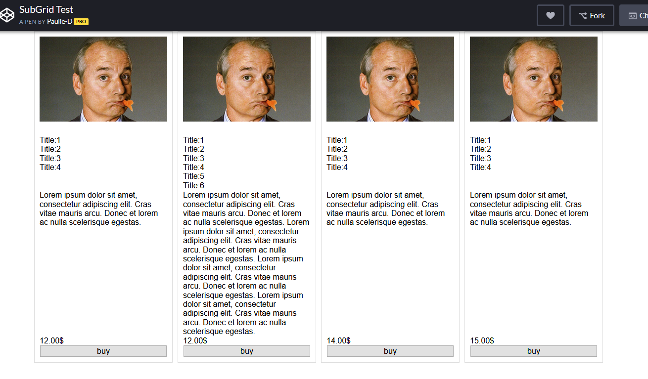
Возможно, вы могли бы добиться того же и без subgrid, хотя это немного сложнее.
В моем примере я не изменил HTML, поэтому я использую display: contents, чтобы как бы поднять дочерние элементы на один уровень дерева DOM. Но если вы можете изменить свою разметку и не обращать внимания на полученный беспорядок, вы также можете добиться этого без display: contents.
.Grid {
    display: grid;
    grid-gap: 10px;
}
.loon-card {
    display: contents;
}
img {
    width: 100%;
    grid-row-start: 1;
}
.short-description {
    grid-row-start: 2;
}
.long-description {
    grid-row-start: 3;
}
.price {
    grid-row-start: 4;
}
button {
    grid-row-start: 5;
}
<div class = "Grid">
<div class = "loon-card">
<img src = "http://www.fillmurray.com/300/200">
<div class = "short-description">
Title:1
<br />Title:2
<br />Title:3
<br />Title:4
</div>
<div class = "long-description">
Lorem ipsum dolor sit amet, consectetur adipiscing elit. Cras vitae mauris arcu. Donec et lorem ac nulla
scelerisque egestas.
</div>
<div class='price'>12.00$</div>
<button>buy</button>
</div>
<div class = "loon-card">
<img src = "http://www.fillmurray.com/300/200">
<div class = "short-description">
Title:1
<br />Title:2
<br />Title:3
<br />Title:4
<br />Title:5
<br />Title:6
</div>
<div class = "long-description">
Lorem ipsum dolor sit amet, consectetur adipiscing elit. Cras vitae mauris arcu. Donec et lorem ac nulla
scelerisque egestas. Lorem ipsum dolor sit amet, consectetur adipiscing elit. Cras vitae mauris arcu. Donec
et lorem ac nulla scelerisque egestas.
Lorem ipsum dolor sit amet, consectetur adipiscing elit. Cras vitae mauris arcu. Donec et lorem ac nulla
scelerisque egestas. Lorem ipsum dolor sit amet, consectetur adipiscing elit. Cras vitae mauris arcu. Donec
et lorem ac nulla scelerisque egestas.
</div>
<div class='price'>12.00$</div>
<button>buy</button>
</div>
<div class = "loon-card">
<img src = "http://www.fillmurray.com/300/200">
<div class = "short-description">
Title:1
<br />Title:2
<br />Title:3
<br />Title:4
</div>
<div class = "long-description">
Lorem ipsum dolor sit amet, consectetur adipiscing elit. Cras vitae mauris arcu. Donec et lorem ac nulla
scelerisque egestas.
</div>
<div class='price'>14.00$</div>
<button>buy</button>
</div>
<div class = "loon-card">
<img src = "http://www.fillmurray.com/300/200">
<div class = "short-description">
Title:1
<br />Title:2
<br />Title:3
<br />Title:4
</div>
<div class = "long-description">
Lorem ipsum dolor sit amet, consectetur adipiscing elit. Cras vitae mauris arcu. Donec et lorem ac nulla
scelerisque egestas.
</div>
<div class='price'>15.00$</div>
<button>buy</button>
</div>
</div>@mat только IE не поддерживается
на сегодняшний день display:subgrid не полностью поддерживается во всех браузерах. На данный момент это не решение. caniuse.com/#feat=css-подсетка
@Wreeecks, поэтому я предлагаю решение без подсетки.
@RazvanZamfir это зависит от конкретных требований. display: contents также полезен для flexbox, но flexbox не всегда лучше всего подходит для таких 2D-макетов, как этот, поэтому обычно у вас есть один родительский flex со многими flex-потомками, и иногда вы все еще не можете делать именно то, что вам нужно. пытаясь сделать. зависит от требований.
Немного JavaScript может помочь. Получив максимальную высоту, вы можете определить это для всех классов
function textHeight() {
  var reed = document.getElementsByClassName("titles")

  let lengths = Array.from(reed).map(e => e.offsetHeight);
  let max = Math.max(...lengths);

  for (let i = 0; i < reed.length; i++) {
    reed[i].style.minHeight = max + "px"
  }
}
textHeight();
.kind-words {
margin-top: 3%;
margin-left: 10%;
margin-right: 10%;
display: flex;
}
.word {
background-color: #F5F5F5;
float: left;
width: 50%;
margin-left: 1%;
margin-right: 1%;
padding-left: 5%;
padding-right: 5%;
padding-top: 3%;
padding-bottom: 3%;
border: solid 1px #B1976B;
display: flex;
flex-flow: column;
}<div class = "kind-words" style = "margin-bottom: 4%;">
<div class = "word">
<h1 style = "text-align: center; font-family: avenirNext; font-size: 30px; color: #B1976B;">Mark D. Griffith</h1>
<h1 style = "text-align: center; font-family: avenirNext; font-size: 20px; color: #B1976B;" class = "titles">Griffith & Associates</h1>
<h1 style = "text-align: center; text-align:justify; font-family: avenirnext; font-size: 20px; line-height: 1.5em; color: #54595F;">I would not try any level criminal allegation regarding sexual assault without the help of Dr. Pierce. I have tried many of these cases and the most valuable asset when I do is Dr. Pierce. He has testified in many of my cases with the outcome being
the two word verdict my client so badly needs. The most clear and concise witness I have ever used. I have come to the point where I feel the only way to be truly effective is to have him on our team when we go to trial. He is approachable, understanding,
and infinitely knowledgeable.
</h1>
</div>
<div class = "word">
<h1 style = "text-align: center; font-family: avenirNext; font-size: 30px; color: #B1976B;">Katheryn H. Haywood
</h1>
<h1 style = "text-align: center; font-family: avenirNext; font-size: 20px; color: #B1976B;" class = "titles">The Law Office of<br> Katheryn H. Haywood, PLLC </h1>
<h1 style = "text-align: center; text-align:justify; font-family: avenirnext; font-size: 20px; line-height: 1.5em; color: #54595F;">Dr. Pierce is my ONLY expert for child abuse cases. He is a national leader in understanding false accusations based on fear of the boogey man/family dynamics/hyper-sensitivity to touching based on past trauma. I have been doing sex defense work for
20 years. Dr. Pierce is the expert I rely on to help me understand the intricacies of my cases. He is a straight shooter. And perhaps more importantly, he speaks very well to juries in common language which is clear, concise, and not elitist. I
have 5 cases pending with Dr. Pierce and have yet to lose one where he has consulted/testified.
</h1>
</div>
</div>
дисплей: содержимое; не поддерживает IE и EDGE